

Achieve 2026
Achieve's homepage was the highest-traffic page on the site. It was also the lowest-converting. This is the full story, including what didn't work, why, and what we did about it.
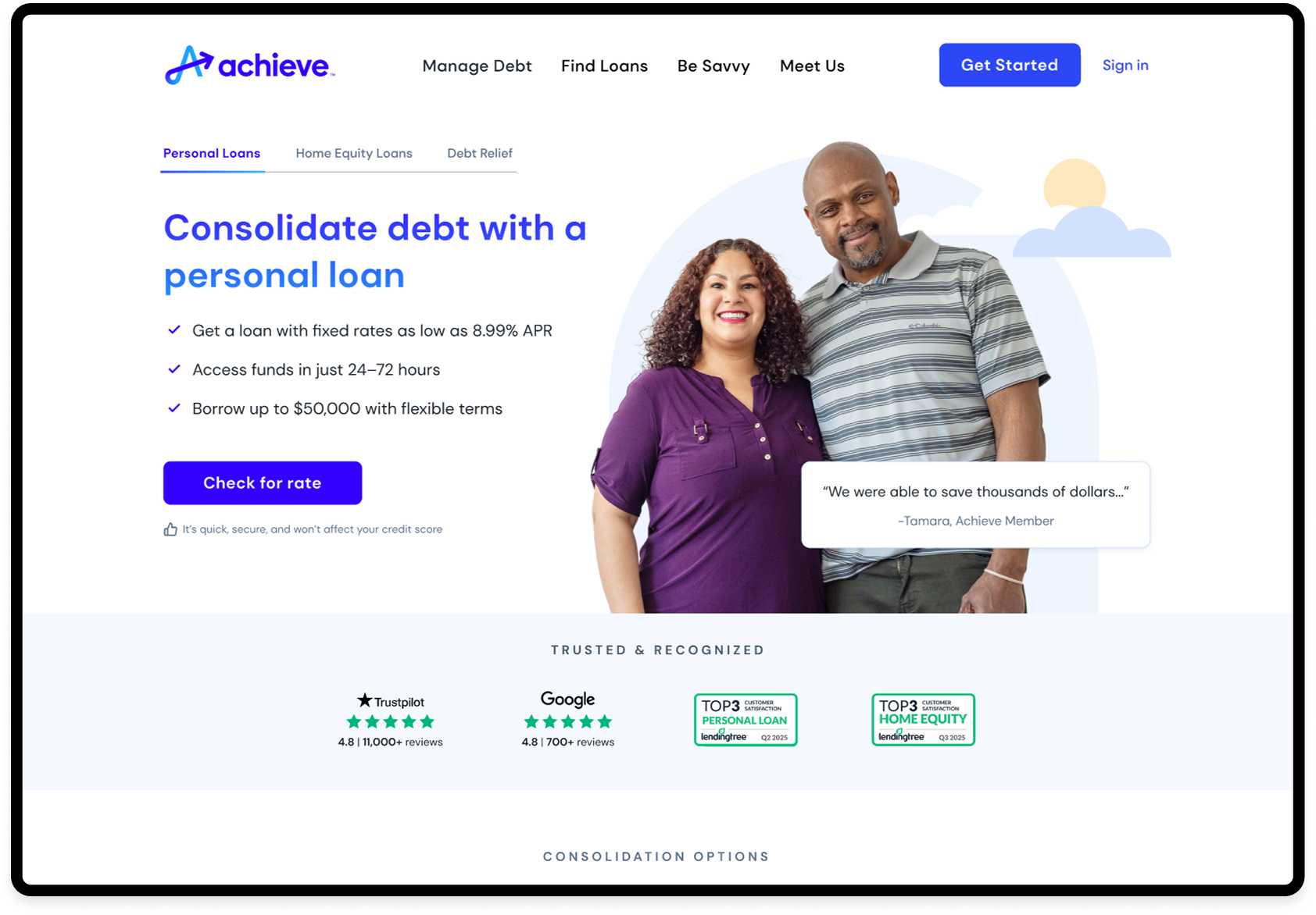
Achieve's homepage received over 300,000 sessions a month, but converted at 5.2% Direct-to-Marketplace, the lowest rate on the site. The Personal Loans page converted at nearly 40%. Same traffic source. Seven times the result. The gap wasn't a design problem. It was a narrative problem. The page was built for a debt-relief brand. The users arriving were looking for a loan.
Timeline: 4 months
Role: Staff Product Designer
Team: 1 PM, 1 UX Writer, and 3 Engineers
Tools: Figma, Figma Dev Mode, AI-assisted prototyping, Figma Make
01
The gap wasn't a design problem. It was a narrative problem.
The homepage was built for a debt-relief brand. The users arriving were looking for a loan. The page was speaking the wrong language to the right people, and losing them before they had a chance to find what they came for.
Achieve was repositioning from a debt-relief company into a multi-product financial platform. The homepage hadn't caught up. It still led with urgency, rescue, and crisis at a moment when most users were arriving with a very different intent: explore a loan, check a rate, understand their options.
02
The users arriving weren't in crisis. They were comparison-shopping.
Before touching a frame in Figma, I used AI to compress competitive analysis and session synthesis, work that would have taken days, into a focused set of hypotheses. What emerged: users had decent credit, a clear financial goal, and a willingness to act if the page could give them confidence.
They didn't need to be convinced. They needed to be met where they already were. That reframe changed everything. We weren't designing a marketing page. We were designing a decision platform.
03
Concept testing validated it. Production told a different story.
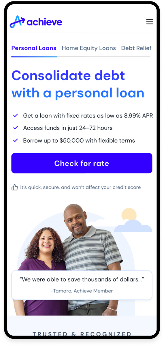
The first variation launched in February 2026. Lending-first headline, trust signals above the fold, a single entry point to rate check. We added a comparison tool, an interactive slider across PL, HELOC, and Debt Relief, and a Product Fit Quiz for users who weren't ready to commit.
Concept testing: the comparison tool hit 88% comprehension. The quiz showed 90% stated click intent with the '4 questions / 60 seconds' framing. We felt confident.
Then live data came back.
04
More content, more tools, more pathways - for a financially anxious user, that's not clarity. That's paralysis.
Engagement dropped from 18% to 15%. The control, a single slider, a number, one CTA, was outperforming everything we'd layered on top of it.
The Product Fit Quiz had near-zero production engagement despite 90% stated intent in testing. That gap is the most important thing I took from this project: what people say they'll do and what they actually do in a high-stakes financial decision are not the same thing.
The comparison tool showed +45% CTA CTR among users who reached it. The concept was right. The placement was wrong. I made the call to cut the quiz entirely, move the tool directly under the hero, and strip everything that wasn't doing measurable work.
06
Four decisions. One principle: earn confidence before asking for commitment.
07
When you align the experience with user intent, every downstream metric improves.
08
The biggest shift wasn't a design decision; it was a framing decision.
Treating the homepage as a decision platform rather than a marketing entry point changed what we prioritized, how we talked to stakeholders, and what we measured.
Cutting the quiz was the right call. Making it fast, without waiting for a new brief, without protecting the work, is what made the difference between one failed test and a corrected version that delivered.