

Achieve Personal Loans Landing Page 2026
Using research and experimentation to improve one of Achieve's highest-intent product experiences
Role: Staff Product Designer · Design Lead
What I worked on: Product Strategy, Research, UX/UI, Experimentation, Content Direction
Partners: Product · Content · Data · Engineering
Impact: +$638k incremental marketing margin/year. Lending first brand initiative: +$2M annualized total
01
People were arriving ready to explore a loan. We could make that first step easier.
The opportunity
The Personal Loans page is one of the highest-intent experiences on Achieve.com. People coming here are usually already considering a loan and trying to figure out whether Achieve is right for them.
The existing page had plenty of information, but some of the most useful things were getting lost.
Trust showed up later than it needed to. Important details about the process were competing with other content. And our main CTA — “Get Started” — didn't tell someone much about what would happen next.
I started looking at the page through a simpler question:
What does someone need to know before they feel comfortable checking their rate?
Baseline 90,804 sessions/mo · 38.6% Direct-to-MP · 14.1% Lead/Session
02
The decision journey
Understanding the hesitation
Someone considering a personal loan isn't just browsing a page. They're making a financial decision.
Before continuing, they may want to know whether the product fits their needs, whether they can trust the company, what happens next, and whether checking their options comes with any risk.
That made me look differently at the experience. Instead of asking what else we could add to the page, I started looking at where we could remove uncertainty.
03
This project was an early test of what AI-integrated practice looks like in production.
Explorations
I explored different ways of simplifying the page, bringing reassurance closer to the decision, and making the next step more specific.
One of the smallest changes ended up being one of the clearest examples of the thinking behind the redesign.
Our CTA said: “Get Started”
The problem was that it left a lot unanswered. For a financial product, “getting started” could mean applying for a loan, opening an account, or committing to something.
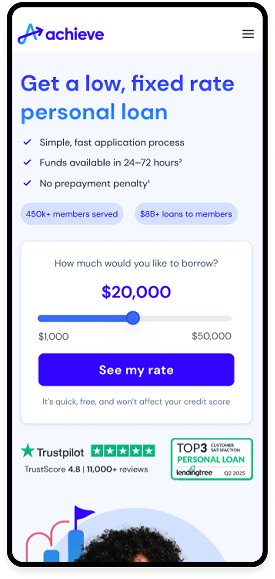
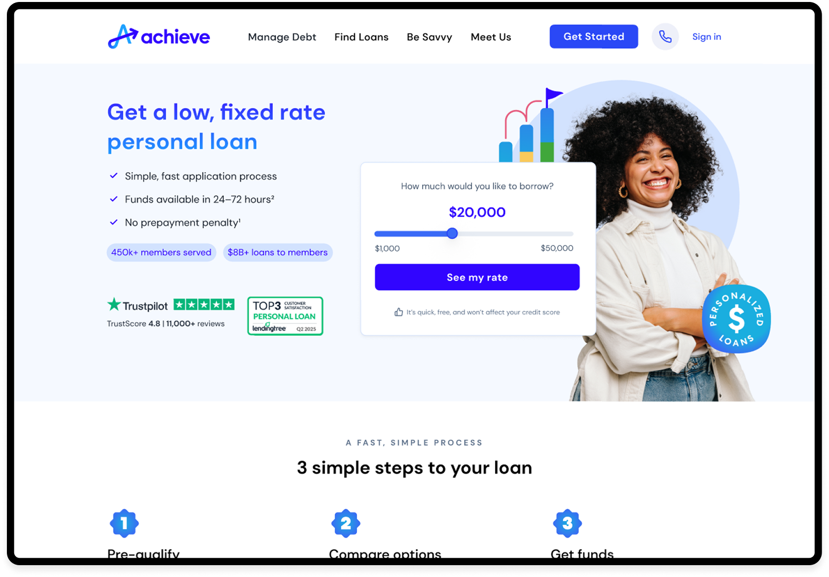
We moved toward: “See my rate” with reassurance that checking was quick, free, and wouldn't affect someone's credit score. It gave people a much better idea of what they were agreeing to before they clicked.
04
Trust moved closer to the decision.
The original experience had credibility throughout the page, but some of the strongest reassurance appeared after we'd already asked people to take action.
I brought trust earlier, closer to the moments where someone was deciding whether to continue.
The page became easier to scan.
I worked with Content to simplify the hierarchy and focus the experience around the information someone needed to evaluate the product.
Not everything needed equal weight. Some things needed to come earlier. Some could come later. And some didn't need to be there at all.
The next step became more specific.
Instead of a generic invitation to “Get Started,” we told people what they could actually do next: see their rate.
That shift carried into the supporting copy as well, giving people more context before asking them to continue.
What changed
Before and after
05
Final decision
The final experience
The redesign was intentionally simpler.
The hero introduced the product more clearly, brought reassurance closer to the CTA, and made the next step easier to understand.
As people moved down the page, the experience gave them enough information to evaluate the loan without making them process everything at once.
The goal wasn't to convince everyone to continue.
It was to give someone enough clarity to decide whether continuing made sense for them.
06
Results
We tested the redesigned experience against the existing page.
I was interested in more than whether someone clicked the CTA. We looked further into the journey to understand whether the changes were helping people continue through the funnel.
The variation improved performance from lead generation through enrollment and close.
Then we tested it
+15.5%
Lead Rate
+29.2%
Enrollment Rate
+25.4%
Close Rate
+75.5%
Margin / Session
+$638k
Incremental margin / yr
07
From test to pattern
What happened next
The Personal Loans experiment gave us ideas we could test elsewhere.
We started looking at similar questions across other product experiences: how much information belongs in the hero, where trust should appear, how specific CTA language should be, and which patterns could be reused instead of redesigned every time.
Those experiments eventually became part of a larger effort to create more consistency across Achieve.com while still giving us room to test and learn.
The Personal Loans page wasn't a template for every other product. The principles behind it became something we could keep testing on other products.