Betts Recruiting had just gone through a brand refresh and needed someone to make it buildable. I came in as a freelance Art Director with one primary focus: to develop the design system that would translate their new visual identity into reusable components, page templates, and patterns the internal team could actually work from.
Brand guidelines tell you what something should look like. A design system tells you how to build it consistently at speed. That gap was the brief.
Betts Recruiting
Building a design system for a new brand, web, campaign, and motion.
Timeline: 2-3 months
Role: Freelance Art Director — Design System Lead
Team: 1 Product Marketing Manager, VP of Marketing, and 2 Engineers
01
The Design System
Betts had the visual language, the colors, typography, and tone. What they needed was the infrastructure to apply it consistently without reinventing decisions on every new surface.
I built that infrastructure. Starting from the brand guidelines, I established:
Type hierarchies and scale
Spacing and layout logic
Color application rules across light and dark contexts
Component patterns for buttons, cards, navigation, and forms
Interactive states and hover behaviors
Page templates that the engineering team could build directly
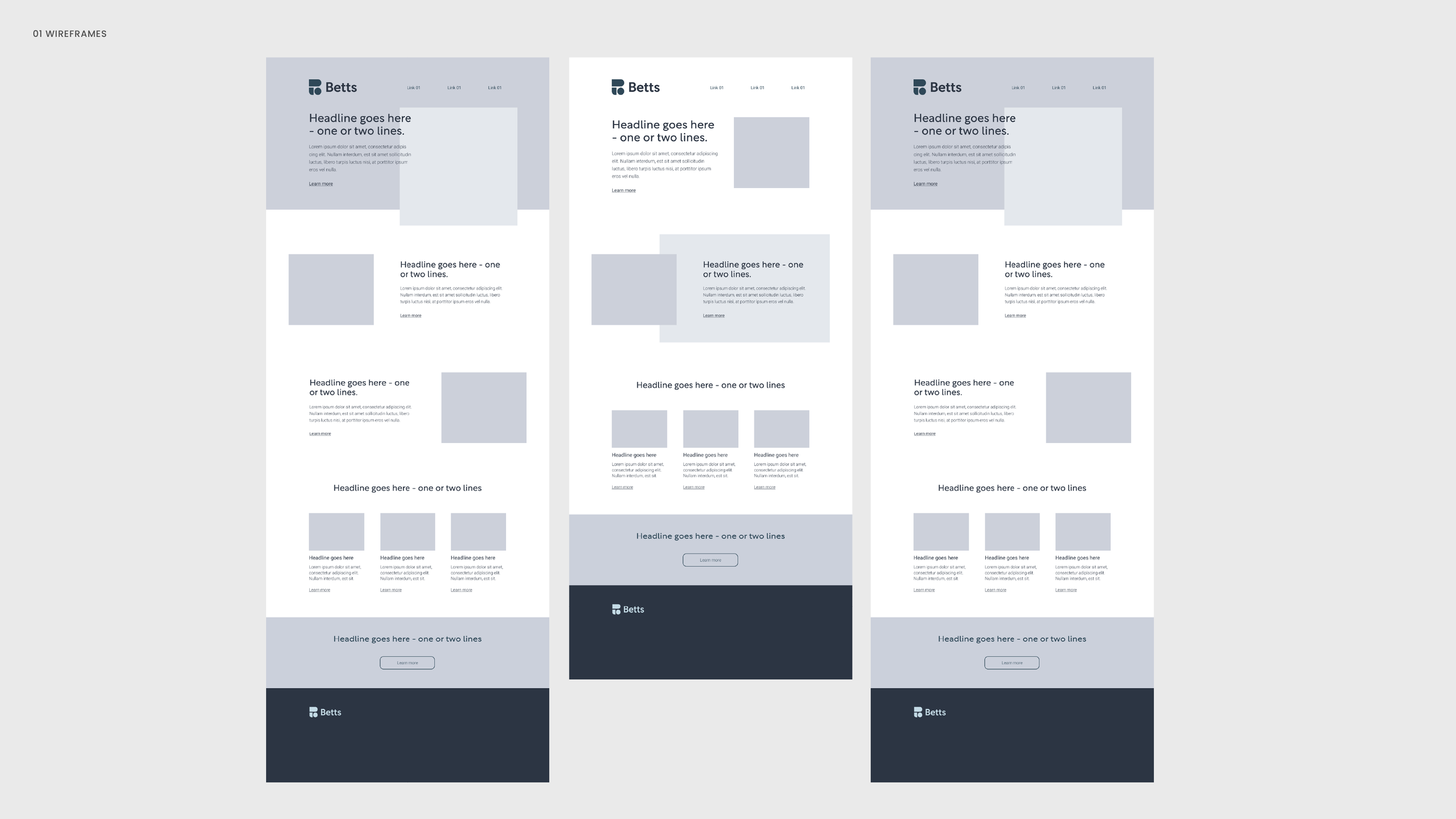
The wireframes came first, defining the structural logic before the visual layer so that engineering had clear intent, and the team had reusable patterns rather than one-off solutions.
02
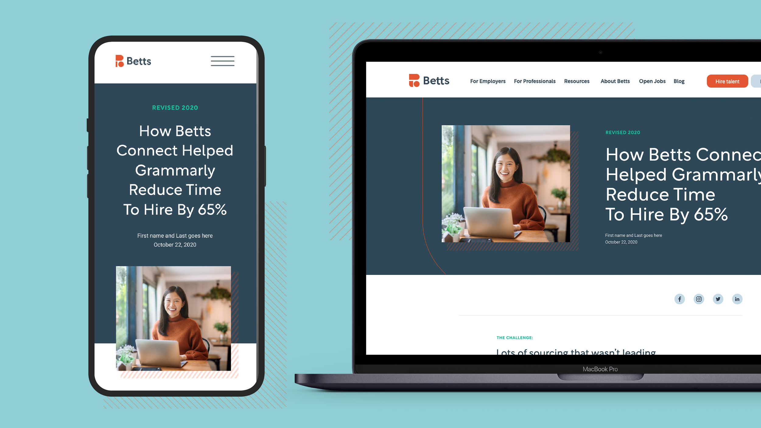
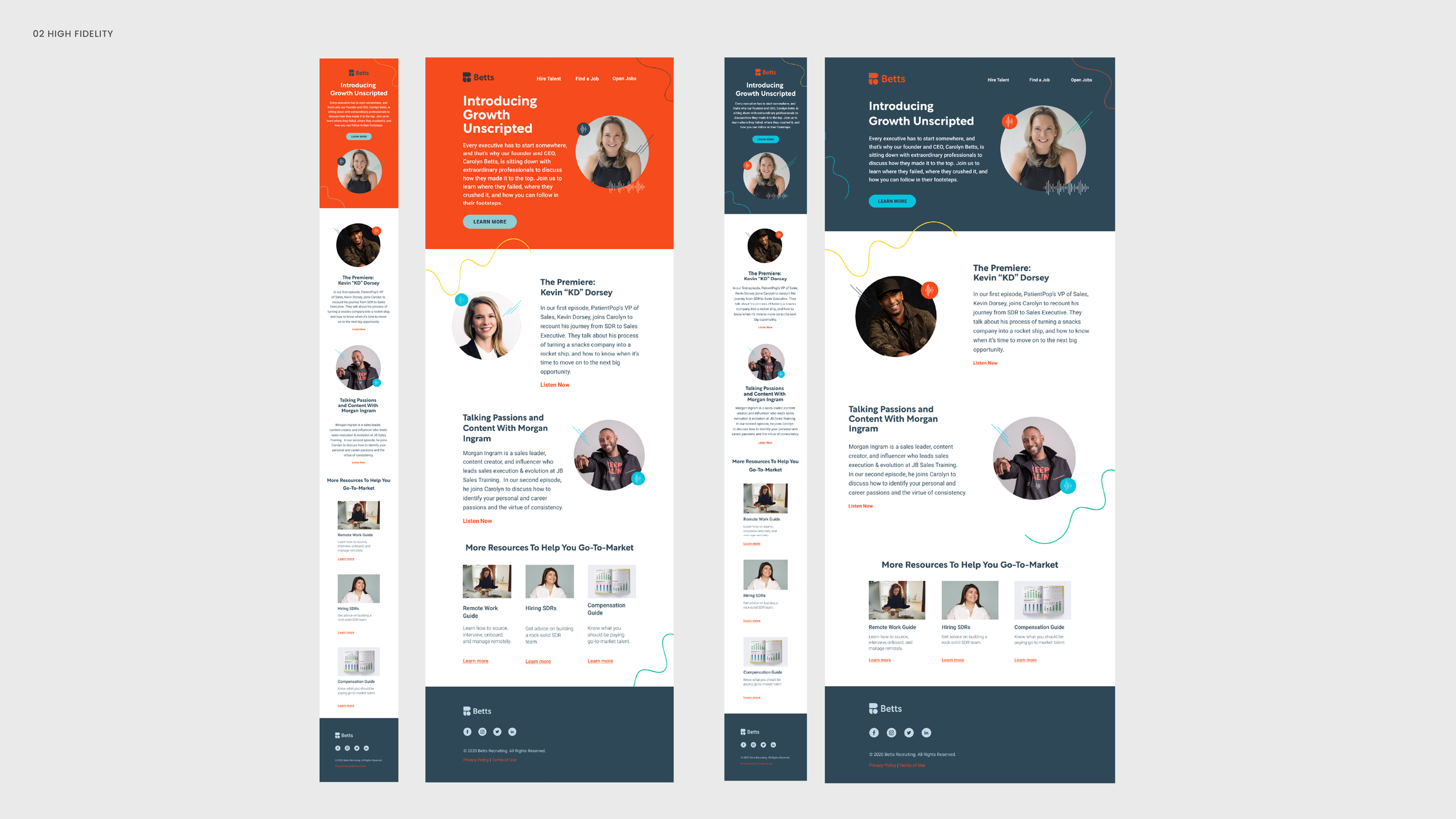
Web Pages
With the system in place, I designed the key marketing pages, applying the components and pressure-testing the design system against real content needs.
Building out the actual pages was how we validated the system, identified gaps, and closed them before the engineering team built anything.
The scalable foundation helped the team to extend independently, without losing visual coherence or needing to loop in design for every new decision.
03
Digital Campaign Assets
The design system had to work beyond the website. I extended the visual language across digital campaign materials, applying the same component logic to ads, social formats, and promotional assets.
For a brand in the middle of a repositioning, it's how you signal that the new identity is real and intentional, not just a new logo on the same old templates.


04
Motion Integration
Motion was part of the brand language. I designed and directed the After Effects templates for Betts' podcast video series, launched during the early pandemic period when the company needed to maintain audience connection through a new digital format.
The motion work had two requirements: it had to feel like the brand, and it had to be usable by a team without a dedicated motion designer. That meant the timing, easing, and transition logic had to be deliberate enough to be on-brand and simple enough to be adapted without breaking.
The closing sequences, lower thirds, and transition patterns were all designed to be reused and extended across episodes without requiring design involvement each time.
05
Takeaway
The visual language at Betts was already defined; my job was to make it buildable, repeatable, and fast for a team that didn't have the bandwidth to reinvent decisions on every new surface.
That's the part of design systems work that doesn't always show up in a portfolio: the thinking that happens before any component is drawn. Deciding what needs to be systematic, what can stay flexible, and how to document the difference so the system outlives the project.
That thinking is what I brought here and what I bring to every system-level problem.