Achieve dot com Homepage Transformation
The homepage was the highest-traffic page on the site. It was also the lowest-converting. This is the story of what it took to fix it.
Achieve's homepage received over 300,000 sessions a month, but converted at 5.2% Direct-to-Marketplace, the lowest rate on the site. The Personal Loans page converted at nearly 40%. Same traffic source. Seven times the result. The gap wasn't a design problem. It was a narrative problem. The page was built for a debt-relief brand. The users arriving were looking for a loan.
Timeline: 4 months
Role: Staff Product Designer
Team: 1 PM, 1 UX Writer, and 3 Engineers
Tools: Figma, Figma Dev Mode, AI-assisted prototyping, Figma Make
01
Context & Strategic Challenge
Achieve was repositioning from a debt-relief company into a multi-product financial platform. But the homepage hadn't caught up. It still led with the old story - urgency, rescue, crisis, at a moment when most users were arriving with a different intent entirely: they wanted to explore a loan, check a rate, understand their options.
The result was structural misalignment at the highest-traffic point in the funnel. Users who should have been converting into loan applicants were bouncing, confused, or being routed into the wrong product flows downstream.
The homepage received 308,935 sessions per month, the highest-traffic page on the site. But it converted at 5.2% Direct-to-Marketplace with a 67.7% bounce rate.
02
Key Insight
The users arriving on the homepage weren't in crisis. They were comparison-shopping.
They had decent credit, a clear financial goal, and a willingness to act if the page could give them the confidence to do so. They didn't need reassurance. They needed transparency: real numbers, clear eligibility, a process they could trust.
That insight reframed the entire project. We weren't designing a marketing page. We were designing a decision platform.
03
How AI Shaped the Process
This project was an early test of what AI-integrated practice actually looks like in production. I used it across four stages:
Research synthesis. I used AI to surface patterns across user sessions and competitive audits faster than manual analysis, compressing days of synthesis into hours and generating hypotheses I could take directly into testing.
Ideation. Rather than working through layouts sequentially, Figma Make and AI-assisted ideation let me explore multiple IA structures, hero architectures, and trust placements in parallel. That parallel exploration created space for deeper synthesis. I wasn't just iterating visually; I was learning faster.
Microcopy. In a compliance-sensitive financial flow, every word is a design decision. I used AI to generate and pressure-test multiple copy directions quickly, especially for CTAs and trust signals where small wording changes produce measurable conversion differences.
Pattern documentation. As decisions solidified, I used AI to draft component guidelines and document the design patterns that would need to scale across the team, work that often gets deprioritized in fast-moving projects.
04
My Role & Responsibilities
I led design across strategy, research, UX, and execution, from the initial brief through stakeholder alignment, concept testing, and engineering handoff.
That meant defining the lending-first information architecture, designing the comparison tool interaction, and navigating a cross-functional alignment process that involved Product, Brand, Compliance, and Engineering, each with different priorities and constraints.
The compliance relationship was particularly important. In a regulated financial environment, trust signals, rate language, and eligibility framing all require legal review. I brought compliance in early rather than at the end, which saved iteration cycles and shaped the design in ways that made it stronger.
05
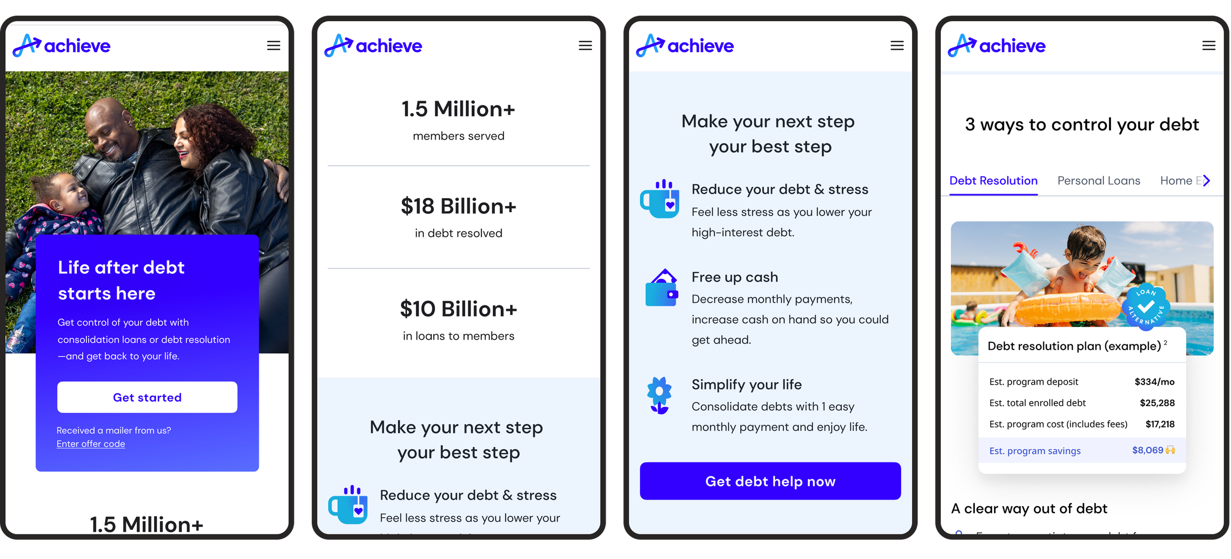
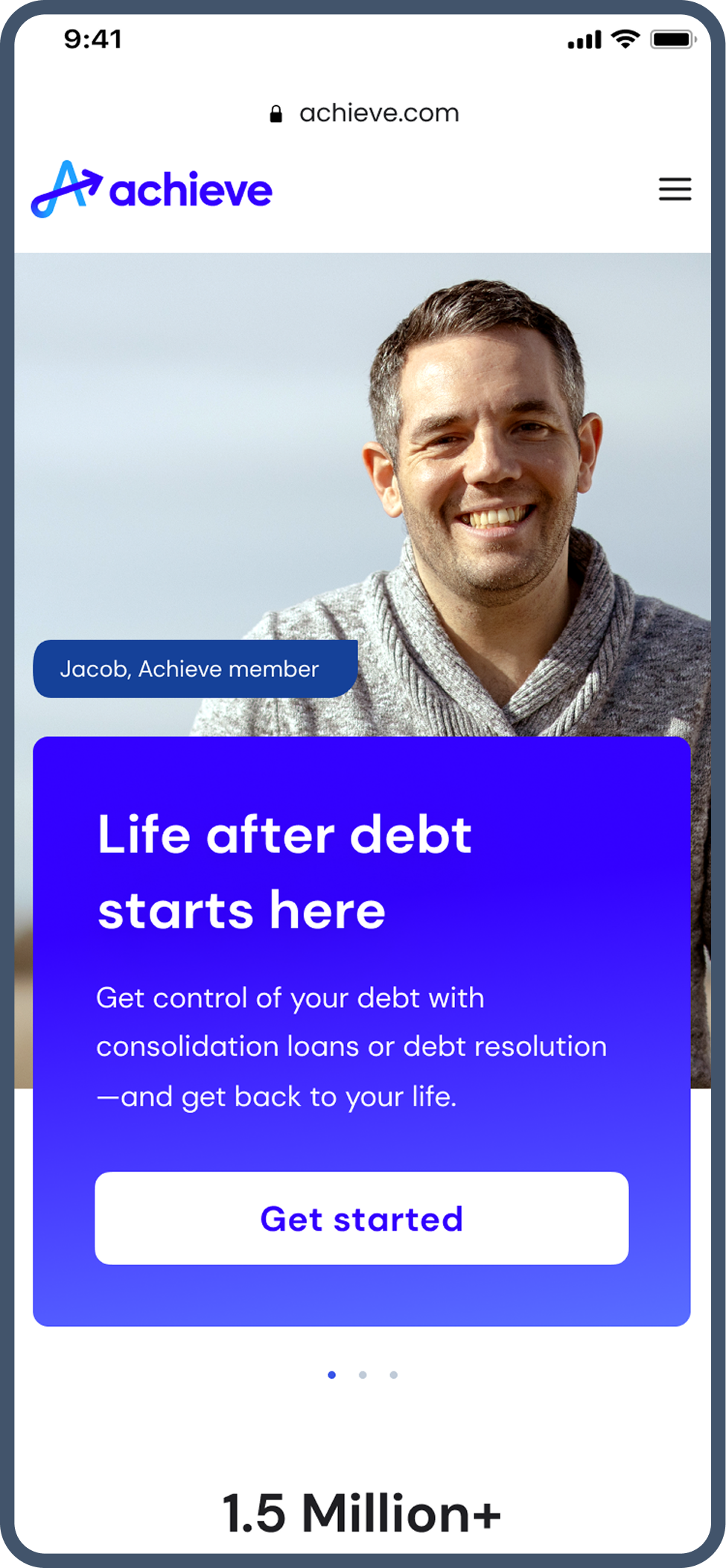
Experience Highlights
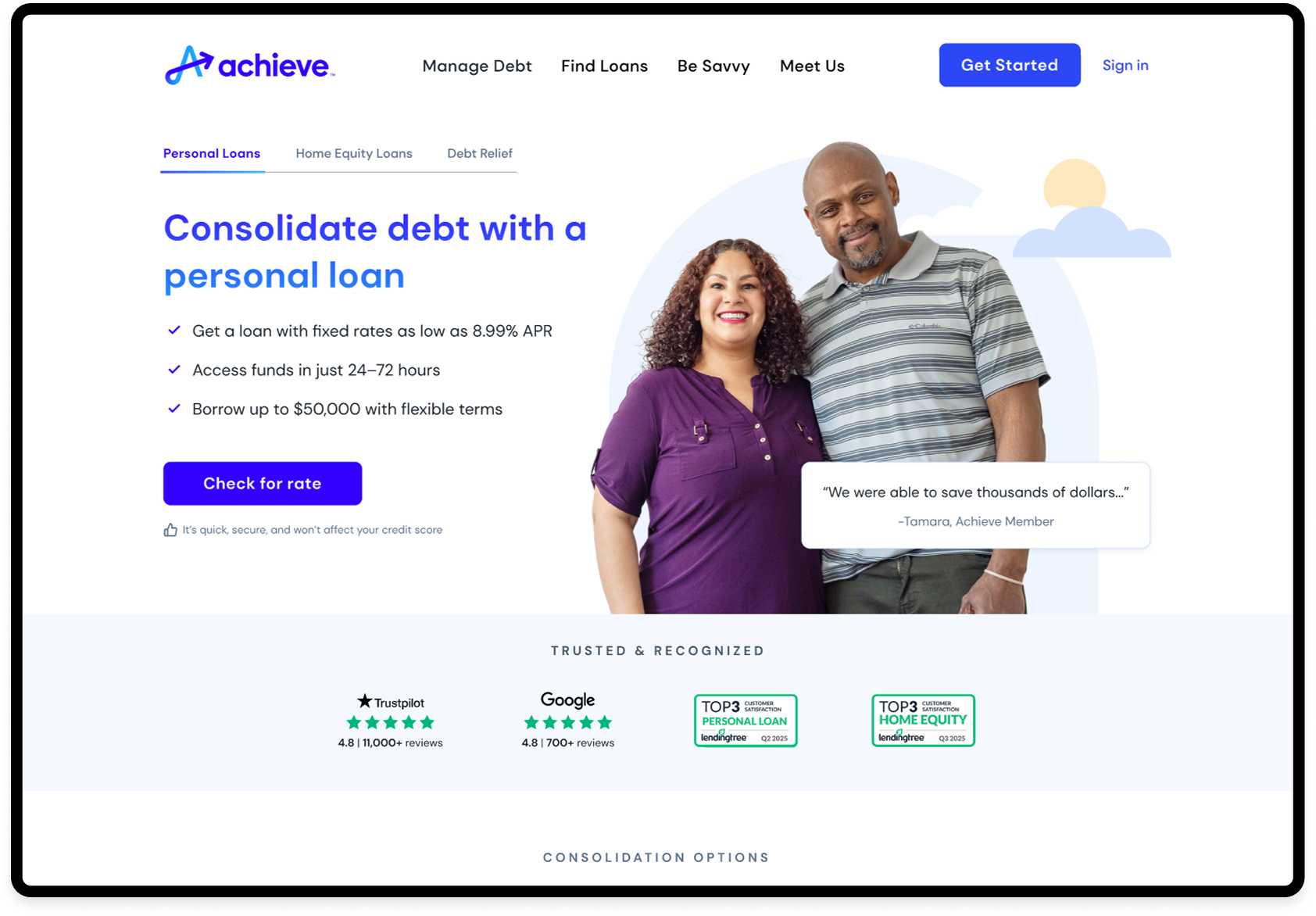
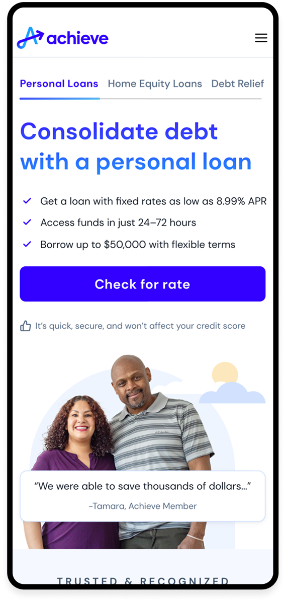
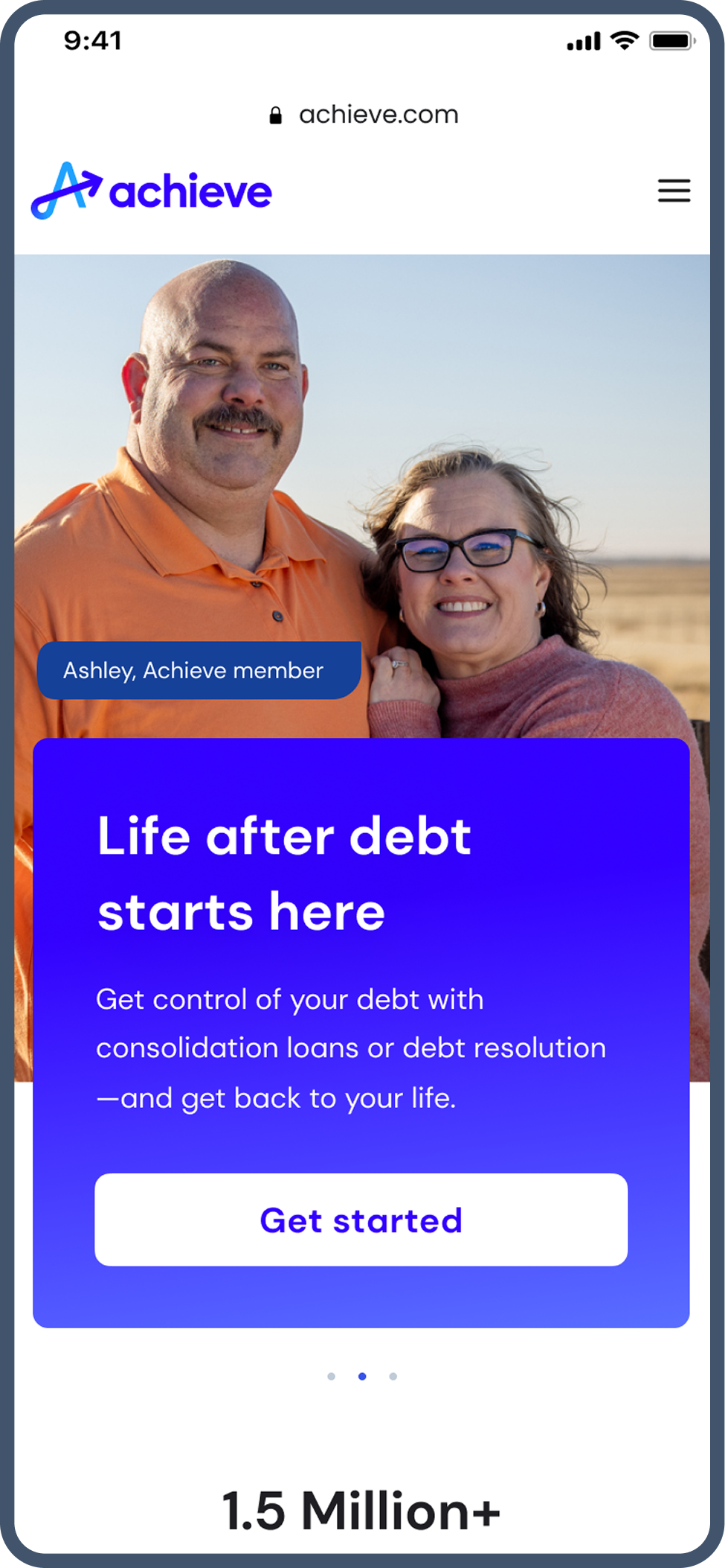
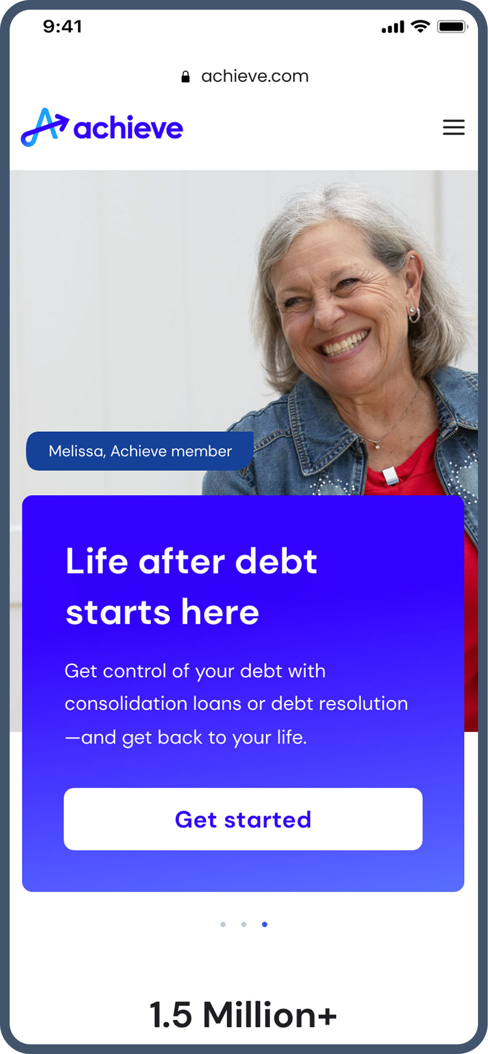
Loan-focused headline, trust signals above the fold, a single frictionless entry point to rate check. The goal: remove every reason to hesitate before the first click.
Hero: The first decision
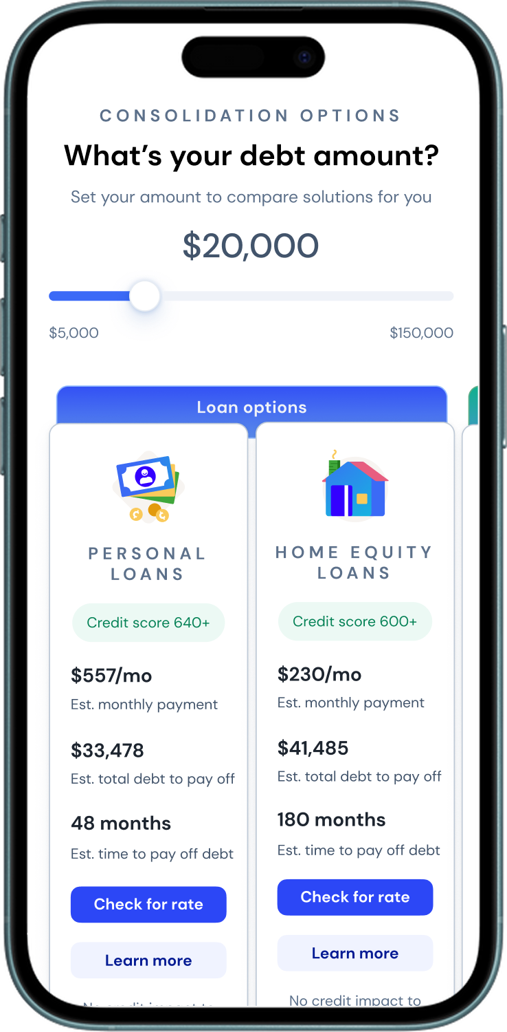
Comparison Tool: The confidence builder
An interactive slider showing real monthly payment estimates across Personal Loans, HELOC, and Debt Relief. Concept testing hit 88% comprehension; users could explain how each product worked without us explaining it. That's the bar.
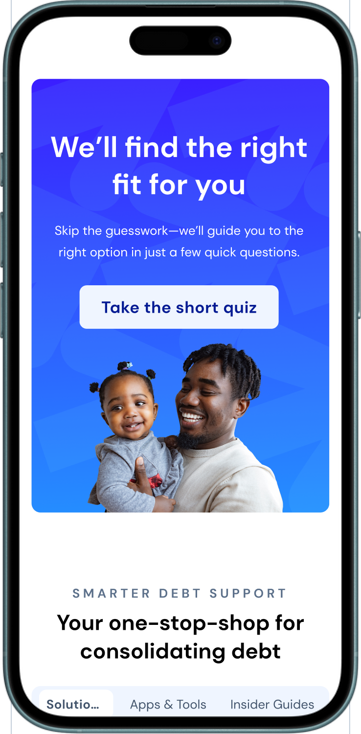
For users who weren't ready to commit, the quiz offered a low-stakes alternative path. 90% engagement in testing. Four questions. Sixty seconds. Guided to the right product. Not a consolation prize, a conversion tool for the segment that would otherwise have bounced.
Product Fit Quiz: The safety net
06
User Research: Concept Evaluation
We tested two hero concepts with 24 participants via unmoderated sessions on UserTesting.com. The results were clear:
Hero B drove 25% higher trust and 30% higher CTA intent than Hero A
The comparison tool achieved 88% comprehension, and users could accurately describe all three products unprompted
45% of users initially confused Debt Relief with a loan product, confirming the need for explicit product differentiation
The Product Fit Quiz showed 90% positive engagement with the "4 questions / 60 seconds" framing
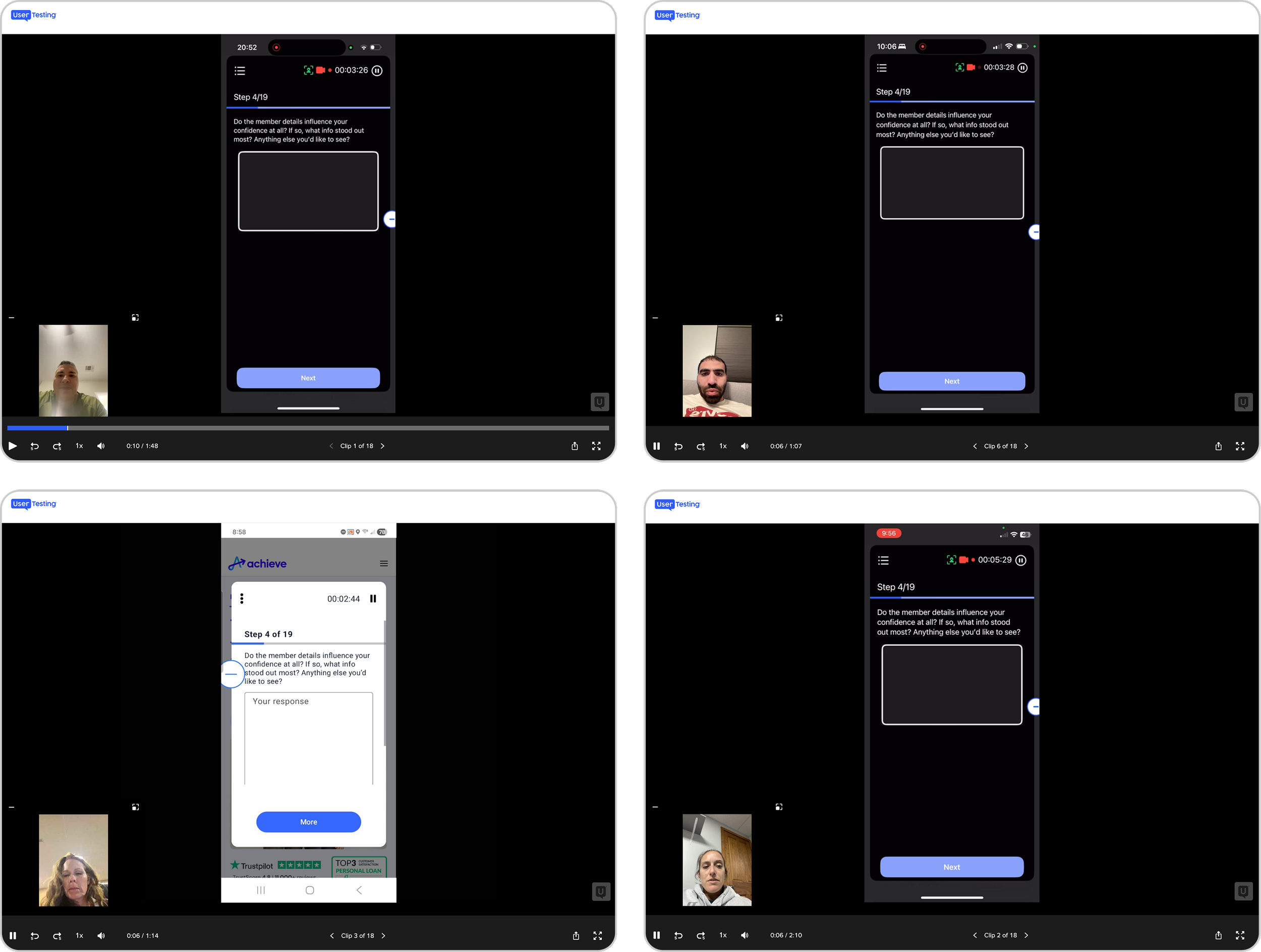
The research didn't just validate the direction; it sharpened it. The 45% confusion finding pushed us to make product differentiation more explicit earlier in the page flow than we'd originally planned.
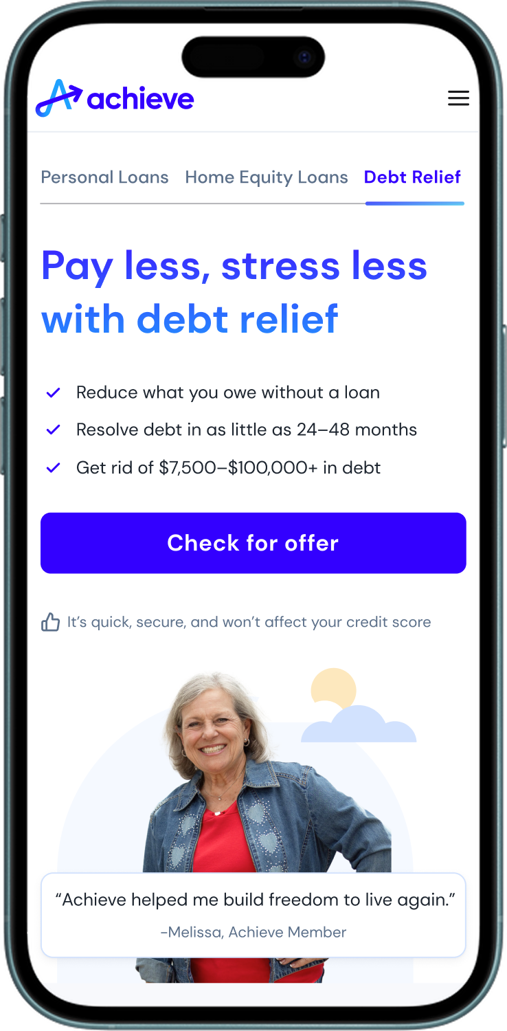
07
Solution Highlights
The repositioned homepage treats debt optimization as the primary lens, personal loans and HELOC lead, debt relief follows as a secondary path for users who need it.
Four decisions defined what shipped:
The hero headline speaks to the user who has arrived to explore a loan, not the user in a financial crisis. The narrative earns attention before it asks for anything.
Lead with lending intent.
Third-party validation, Trustpilot, Forbes, WSJ, moved above the fold. Self-reported internal metrics were removed. External credibility at the decision moment.
Replace claims with proof.
The comparison tool gives users real numbers before they commit. Rate inputs, monthly estimates, side-by-side product comparison. Transparency as a conversion lever.
Make value quantifiable.
"See my rate" not "Apply now." "It won't affect your credit score" directly below the CTA. Every word doing functional work.
Reduce friction at the critical moment.
08
What the Data Told Us
Concept testing validated the direction. Live production told a different story.
The variation launched in February 2026. The headline metrics came back lower than the control across almost every measure.
The control was winning
The control gave users a single, frictionless first step. A slider, a number, one CTA. For someone arriving with financial anxiety, that clarity outperformed everything we layered on top of it.
The Debt Fit Quiz, which showed 90% stated click intent in concept testing, had near-zero engagement in production. That gap is the most important thing I took from this project: what people say they'll do and what they actually do in a high-stakes financial decision are not the same thing.
The one bright spot was the comparison tool, which showed +45% CTA CTR among users who reached it. The concept was right. The placement was wrong.
What we changed based on the live signals:
Moved the comparison tool directly under the hero
Removed the Debt Fit Quiz entirely
Cut the Solutions section at the bottom of the page
Test is still running
09
Takeaway
The biggest shift on this project wasn't a design decision; it was a framing decision. Treating the homepage as a decision platform rather than a marketing entry point changed what we prioritized, how we talked to stakeholders, and what we measured.
But the live data humbled that framing too. A page can be strategically right and still create friction in production. More content, more tools, more pathways, for a financially anxious user, that's not clarity. That's paralysis.
The APL landing page, which launched shortly after and applied every lesson from this test, validated the underlying strategy. Simpler surface, single intent, trust signals in the hero, one frictionless first step. Lead rate up 15.5%. Margin per session up 75.5%. The hypothesis was right. The execution on the homepage needed another iteration.
That's still in progress.