Achieve Product Quiz
Designing an adaptive decision system for uncertain users
The Product Quiz was created to support users arriving at Achieve without a clear understanding of which financial product best fit their situation. Rather than treating uncertainty as friction, we designed the quiz as a guided decision experience that combines behavioral insights, emotional design, and product logic to help users move forward with confidence.
This project expanded beyond traditional website design into a product-led use case. The quiz became a core entry point into Achieve’s platform, helping translate ambiguity into actionable pathways across Lending and Debt Relief while generating valuable insight into user intent and emotional state.
Timeline: ~3months initial build, followed by iterative optimization
Role: Product Design Lead for Quiz Experience
Team: 1 Product Manager, 1 Eng, Creative Director
01
Context & Challenge
Many users arrived overwhelmed, unsure whether they needed a loan, debt relief, or educational resources. Existing entry points assumed clarity, but real user behavior told a different story.
Key challenges:
Users lacked confidence in choosing the right product
Financial stress created hesitation and abandonment
Entry paths were optimized for informed users, not uncertain ones
Teams had limited visibility into early intent signals
The opportunity was to design an experience that could both guide users emotionally and inform product decisions through structured data.
02
Strategic Goals
We aligned on five objectives:
Help users self-identify their needs through guided interaction
Reduce cognitive load during early discovery
Capture meaningful intent signals for downstream personalization
Create a scalable interaction model reusable across journeys
Increase qualified engagement without forcing premature commitment
03
Design Approach
To understand user hesitation and drop-off, I partnered with Research and Analytics:
Methods Used
Funnel analysis across entry points
Qualitative user interviews
Session recordings
Competitive assessment of guided onboarding experiences
Key Insights
Users responded better to questions framed around emotions and goals rather than financial terminology
Early reassurance increased completion rates
Long or technical question sequences caused abandonment
Users needed feedback loops to feel progress
These insights reframed the quiz from a data collection tool into a behavioral guidance experience.
Research & Insights
We grounded the experience in four core principles:
Meet users where they are emotionally
Progress before precision
Reduce cognitive load through structured choices
Treat the quiz as product infrastructure, not a one-off flow
Design Principles
Designed question sequencing to surface emotional context before financial details
Introduced progressive disclosure to prevent overwhelm
Built adaptive branching logic based on user responses
Added progress indicators and reassurance messaging
Simplified answer sets to promote momentum
These decisions helped transform uncertainty into clarity while preserving user trust.
Key Design Decisions
I led the design of the quiz’s information architecture, mapping emotional states to product pathways. Rather than a linear questionnaire, the quiz functioned as a decision framework, routing users based on stress level, goals, and financial context.
This required close collaboration with Product and Engineering to define logic trees, edge cases, and fallback states while maintaining a coherent user experience.
Information Architecture & Flow Design
Cross-Functional Collaboration
This work required alignment with:
Product Management: defining success metrics and flow logic
Engineering: designing branching logic and performance reliability
Brand: Aligning visual standards and brand tone
Regular alignment workshops and shared prototypes kept decisions grounded in both user needs and technical feasibility.
04
The Solution
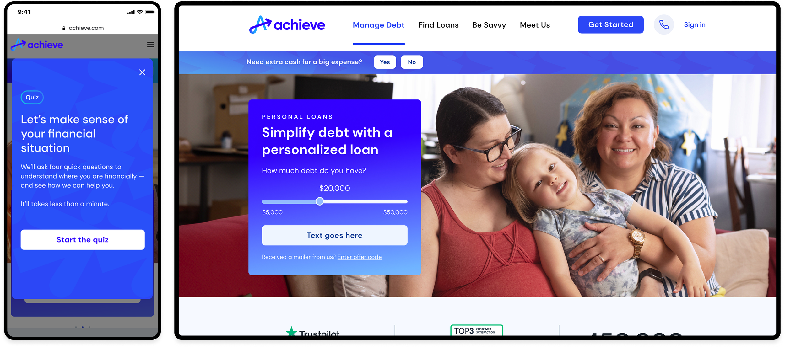
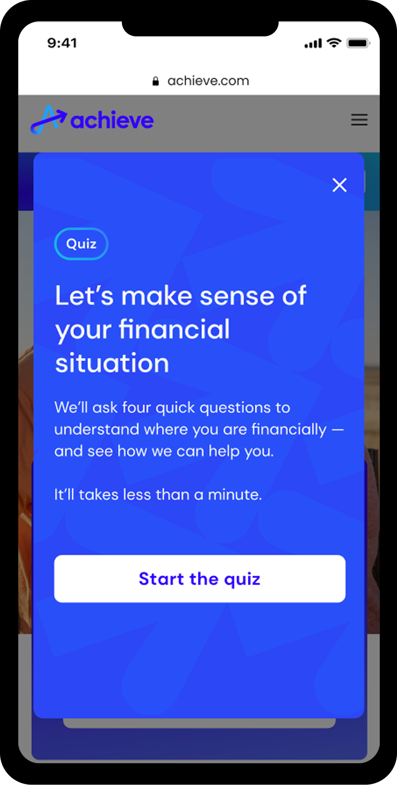
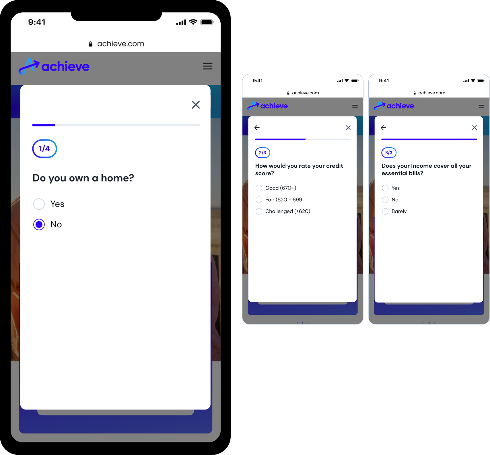
The quiz launches from a persistent banner tailored to page context, offering a clear, low-pressure entry point for users unsure where to begin.
Entry Point: Simple, Low-Friction Start
No PII
High clarity hook question based on user intent
No account required
Onboarding Screen: Setting Expectations
Fast – takes under 30 seconds
Safe – no credit check or sensitive questions
Helpful – the quiz will guide them, not judge them
This screen reassures users that the experience is:
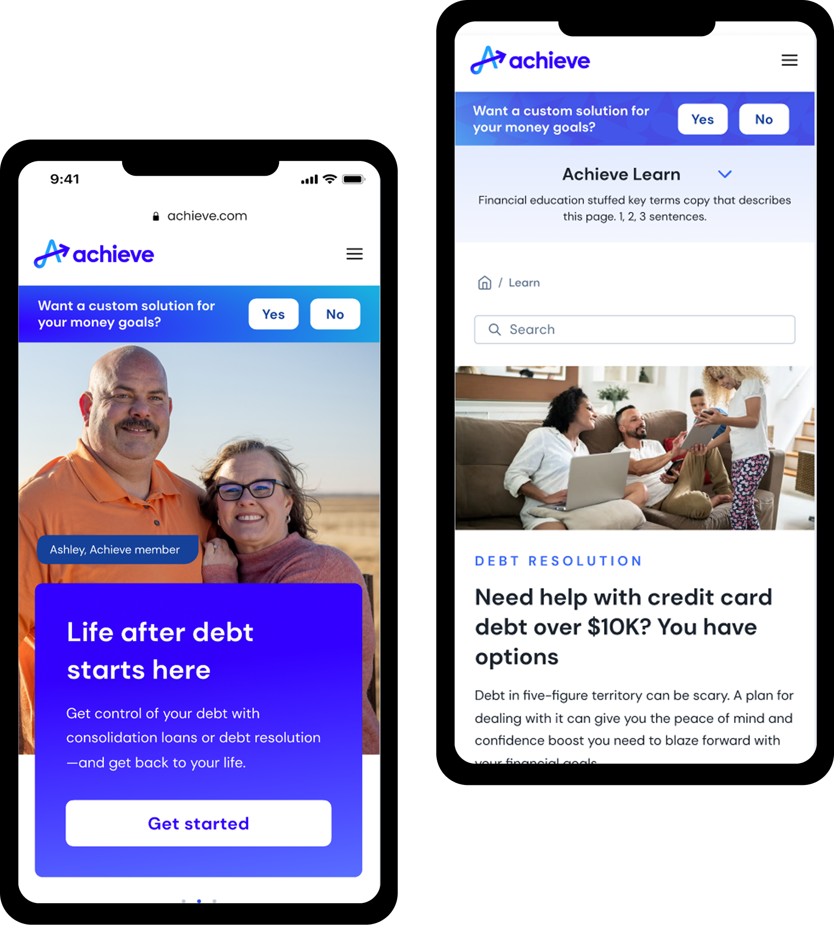
Two-Part Path: Adapts Based on User Inputs
The quiz adjusts based on the user’s financial profile, starting with the most important differentiator:
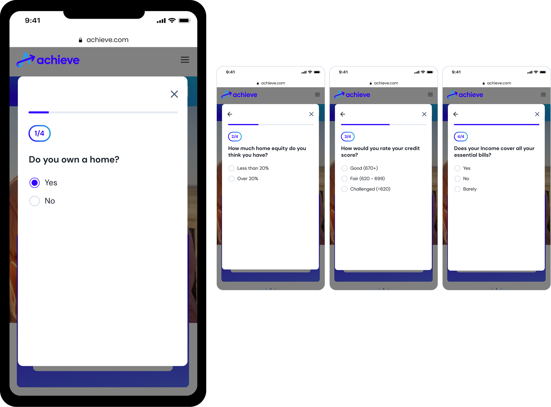
Additional questions surface about equity
Home equity loans may be recommended
Personal loans or debt relief paths adjust dynamically based on credit, debt load, and income stability
Path 1: Homeowners
If the user owns a home:
Two-Part Path: Adapts Based on User Inputs
Flow skips unnecessary home-related questions
Focuses on credit, debt, budget, and payoff timeline
Users are routed to either personal loans or debt relief, based on weighted logic
Path 2: Non-Homeowners
If the user does not own a home:
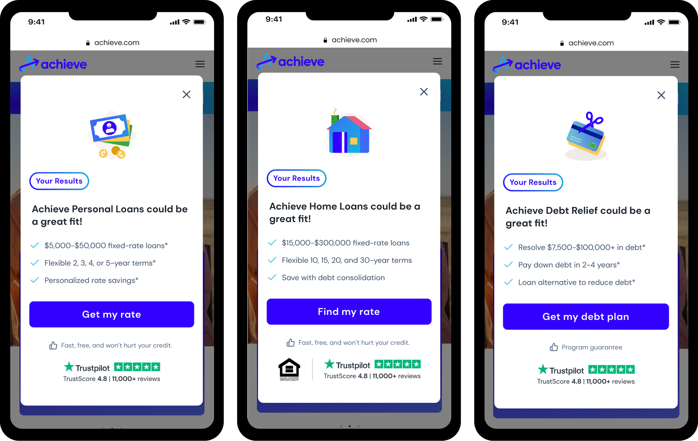
Results Page: Clear, Confidence-Building Recommendation
At the end, users receive a personalized result card that includes:
Recommended solution (home loans, personal loans, and debt relief)
Simple rationale
Trust signals
A single CTA guiding them into the correct acquisition flow
05
Outcomes
While some metrics remain internal, outcomes included:
Increased completion rates among uncertain users
Higher-quality intent signals feeding downstream journeys
Reduced bounce from early entry points
Improved alignment between user needs and product recommendations
More importantly, the quiz reframed how Achieve approaches early-stage discovery.
Supporting Behavior Shifts
06
What I learned
Guided experiences are most effective when they address emotional context first. Designing for uncertainty required shifting from form-based UX to behavioral product thinking, where clarity comes from progression, reassurance, and adaptive logic rather than information density.
Reflection
This project expanded my perspective beyond traditional web design into designing decision systems. By shaping the quiz’s information architecture and emotional flow, we created an experience that helped users feel seen while giving the product clearer signals about intent. It reinforced how powerful structured guidance can be when paired with thoughtful interaction design, analytics, and cross-functional alignment, especially in moments where users feel overwhelmed.