Achieve Website Design Evolution 2022-2026
Leading end-to-end UX across Product, Brand, and AI-driven experiences
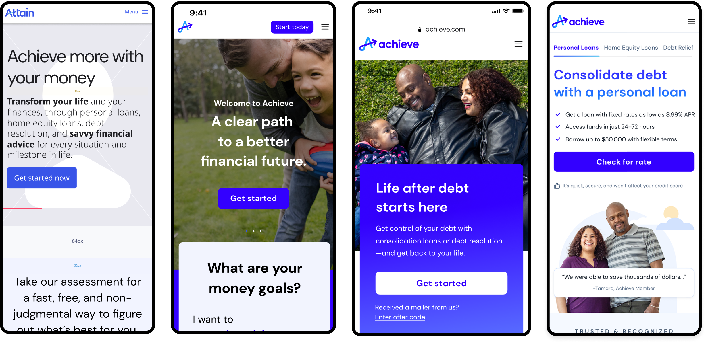
Achieve’s homepage became a strategic focal point as the business expanded from a single service into a multi-product financial platform serving users across lending, debt relief, and education. As products diversified, the homepage needed to evolve from a static marketing page into a product surface that supports intent-based navigation, reduces friction, and aligns with business goals across multiple units.
This case study documents how I led the homepage from initial strategy through multiple redesigns, using cross-functional evidence, rapid experimentation, and AI-assisted workflows to create clarity, scale patterns, and improve alignment across Product, Engineering, Brand, and Analytics.
Timeline: ~6 months for the 2022 design phase, with ongoing iteration
Role: Product Design Lead — Homepage & Core Web UX
Team: 2 Designers, 2 PMs, 1 UX Writer, 1 Researcher, 6 Engineers
Tools: Figma, Figma Dev Mode, AI-assisted prototyping, Figma Make
🚀 Website drove 32% of all Achieve enrollments
💰 Generated 54.4% of total company margin
📈 1.15M unique visitors (+106% growth)
📊 2.02M sessions (+198% growth)
👀 9.87M page views (+259% growth)
2023 Launch-Year Results
🔥 879% monthly traffic growth (Dec ’23 → Dec ’24)
📈 582% YoY increase in non-brand content traffic
⚡ Flow start rate tripled > From 9% in January → 27% in December (+200% increase)
2024 Growth
01
Context & Challenge
When this work began, Achieve’s homepage faced several core challenges:
Users were unsure where to start due to multiple product offerings
Messaging lacked clarity around intent pathways
Navigation did not reflect emerging product complexity
Teams struggled to iterate quickly due to inconsistent patterns
Trust signals were scattered and inconsistently expressed
The task was to transform the homepage into a platform for discovery, conversion, and growth, one that could adapt as new product lines and user journeys emerged.
02
Strategic Goals
We aligned around five primary objectives:
Clarify user intent early to help users self-identify their needs
Support multiple product journeys without cognitive overload
Build modular, reusable patterns for future scalability
Strengthen trust and credibility on high-traffic web paths
Enable rapid experimentation through design and analytics integration
03
My Role & Responsibilities
I led design across strategy, UX, and execution:
Defined end-to-end homepage UX across multiple product pathways
Established messaging hierarchy and brand expression in product
Partnered with PMs to shape roadmap and success metrics
Collaborated daily with engineers using Figma Dev Mode for tighter design-to-code workflows
Prototyped flows and interactions to explore complex, ambiguous problem spaces
Contributed scalable components and patterns to the design system
Mentored designers through critique and design reviews
04
Design Strategy & Process
Research & Insights
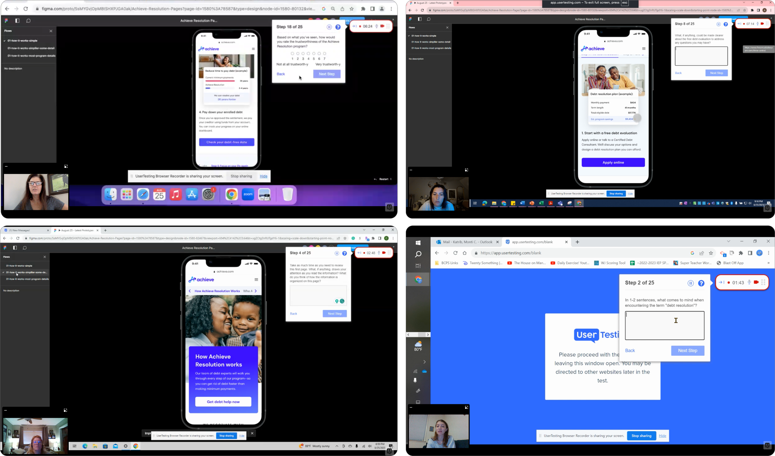
To understand how users interacted with the existing homepage, I partnered with Research and Analytics:
Methods Used
Funnel analysis
User testing sessions
Competitive benchmarking
Key insights
Users made decisions faster when essential information was visible upfront
Trust indicators, like eligibility and rates, helped users feel confident earlier
Clean, scannable benefit sections improved comprehension and lowered hesitation
Inconsistencies in hierarchy created confusion and reduced flow efficiency
These insights guided both content strategy and interaction decisions.
Design Principles
From research and synthesis, we adopted four guiding principles:
Lead with clarity — prioritize key actions and paths
Design for intent — make user choices explicit and visible
Build for scale — use reusable patterns over one-off layouts
Experiment to learn — validate assumptions before engineering implementation
These principles served as a north star through rapid iteration and tradeoff decisions.
AI-Supported Exploration & Prototyping
To accelerate early exploration and reduce ambiguity, I integrated AI-assisted ideation using Figma Make. This approach allowed us to:
Generate structural variations such as hero-first layouts and intent pathways
Explore multiple information hierarchies in parallel
Create early prototypes for testing messaging and trust placements
Rather than replacing critical thinking, AI enabled us to expand the design space quickly and focus on synthesizing meaningful patterns grounded in real user behavior and performance data.
Key Design Decisions
The following decisions fundamentally shaped the redesigned homepage:
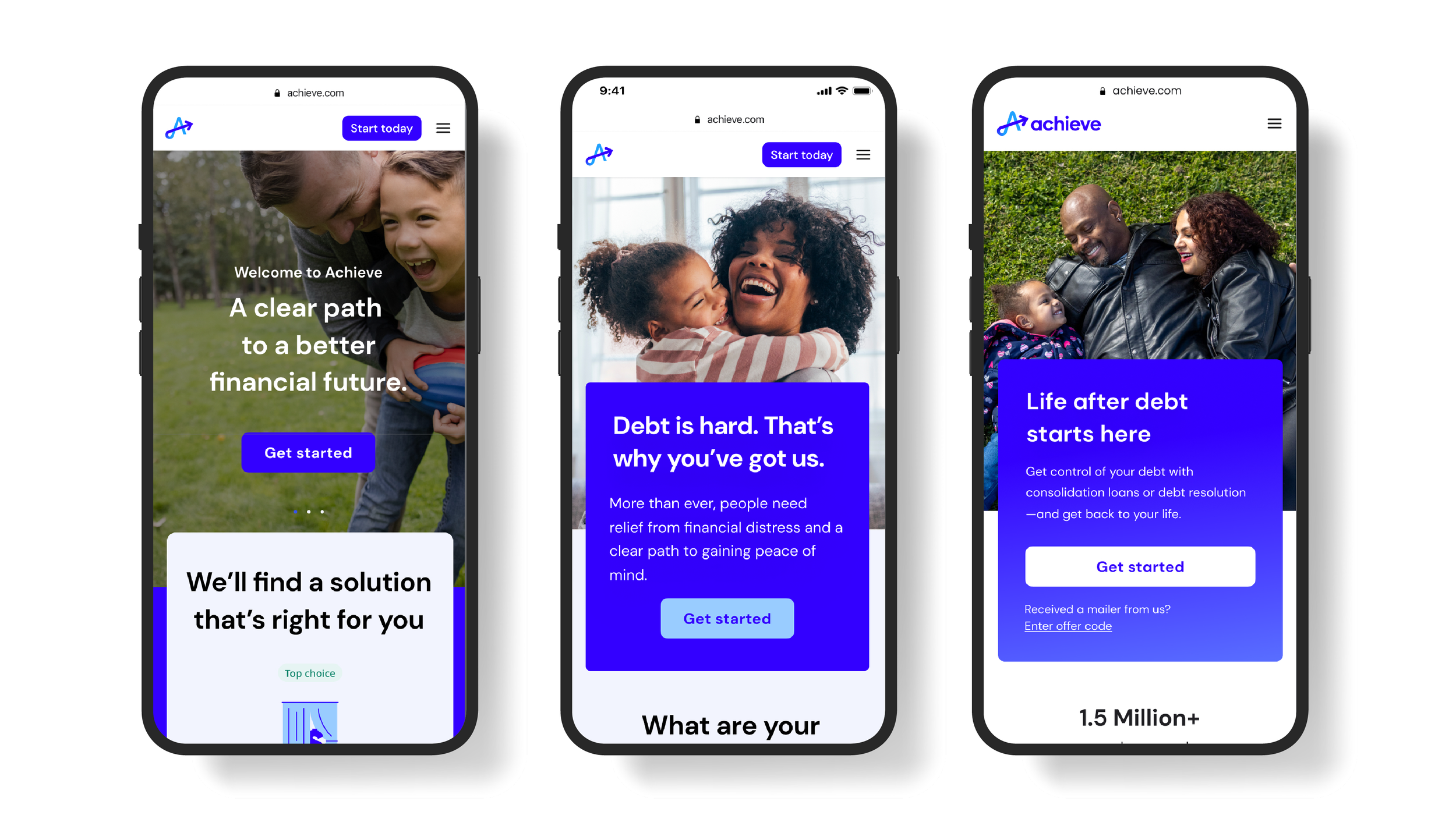
Intent-focused entry points were placed above the fold to help users self-identify goals
Modular sections were introduced to support experimentation without redesigning full pages
Trust signals such as eligibility cues and concise rate summaries were moved earlier in the experience
Human visuals + scannable benefits reduced cognitive effort and increased comprehension
CTA placement and hierarchy were standardized for consistency across devices
These decisions balanced user needs with internal business priorities and technical feasibility.
05
Solution Overview
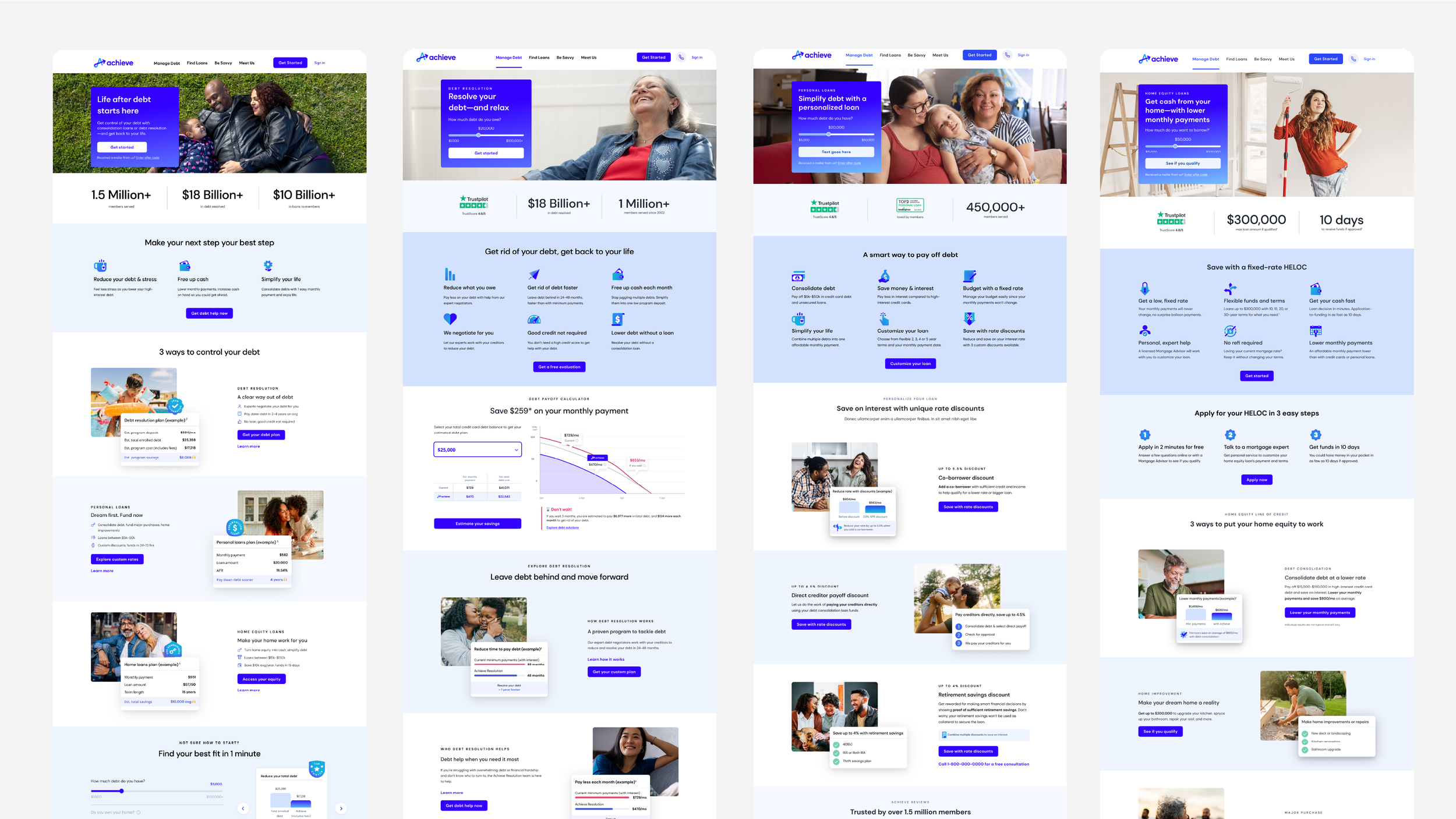
Intent-Driven Pathways
Users are guided to the most relevant product from the moment they land, reducing bounce and hesitation.
Modular Pattern Library
Design elements such as content blocks, trust modules, and CTAs were built as reusable patterns that now live in our design system.
Clear, Scannable Value Propositions
Benefit sections were simplified and prioritized based on user behavior insights.
Trust & Transparency Upfront
Eligibility, key metrics, and timelines are surfaced early to build confidence.
Consistent CTA Placement
Focused CTAs reduce choice overload and improve flow predictability.
06
AI can accelerate early exploration, but impact comes from pairing rapid experimentation with grounded user data. By combining AI-supported ideation with performance signals and competitive insight, we were able to prioritize clarity, trust, and scalable patterns that serve both users and the business.
What I learned
Reflection
Redesigning this homepage taught me how to balance rapid iteration with strategic decision making. It reinforced that the success of a core web surface lies not just in how it looks, but in how it guides users intentionally through complex options. By focusing on clarity, intent, and reuse, the experience now supports both discovery and conversion across product lines.