

Achieve 2026
Rethinking how we introduce Achieve, helping people find the right financial product, and learning from what happened after we shipped.
Achieve's homepage received over 300,000 sessions a month, but converted at 5.2% Direct-to-Marketplace, the lowest rate on the site. The Personal Loans page converted at nearly 40%. Same traffic source. Seven times the result. The gap wasn't a design problem. It was a narrative problem. The page was built for a debt-relief brand. The users arriving were looking for a loan.
Role: Staff Product Designer / Design Lead
Focus: Web Experience, Product Strategy, Research, Growth & Visual Design
Collaborators: Product, Brand, Content, Data, and Engineering
01
Opportunity/Problem
Achieve offers a variety of financial products, and the homepage is often the first place potential customers encounter them.
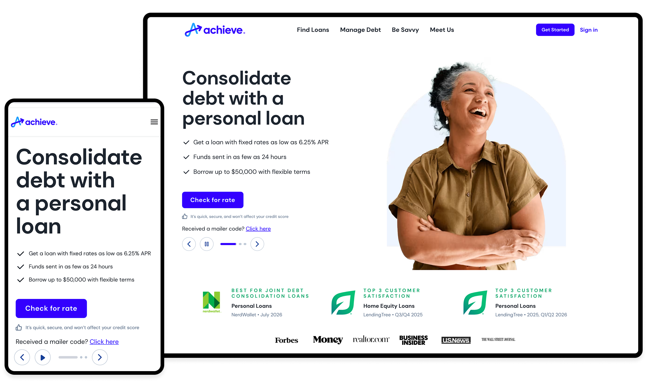
The current design has focused primarily on debt relief. However, after analyzing how people find us and what they are looking for, it became clear that this emphasis did not always align with their intentions. Many visitors are exploring loan options or looking for ways to consolidate their debt; they are not necessarily in financial crisis. Instead, they are comparing their choices and trying to determine what makes the most sense for their situation.
This insight provided a new perspective for the redesign. We needed to consider how the homepage could better meet visitors where they are while also helping them understand the full range of services that Achieve offers.
How could the homepage better meet people where they were, while still helping them understand everything Achieve had to offer?
02
Understanding the experience
Before getting too far into design, I spent time looking at our existing experience, customer behavior, business priorities, and how other companies were solving similar problems.
I wasn't really interested in copying layouts. I wanted to understand a few things:
How quickly could someone figure out what a company offered?
How were multiple products introduced without becoming overwhelming?
Where did trust show up?
And what happened when someone was ready to take the next step?
A lot of our competitors were talking about loans and financial choice in a fairly empowering way, and they were bringing recognizable third-party credibility into the experience early. Achieve was still leading with a much more crisis-oriented debt story.
That made me question whether we were framing the experience around how the company thought about its products rather than how customers were actually arriving.
03
Explorations
I didn't want to jump from the problem straight into a polished solution.
I explored different ways of introducing the products, establishing trust, and helping people figure out where they belonged.
Some concepts were much more product-forward. Others focused on storytelling or education. I also explored ways to let people identify what they needed before asking them to enter a product flow.
Sharing those ideas early helped make the conversations with Product, Brand, and other stakeholders much more concrete. We weren't debating an abstract strategy anymore. We could look at something together and talk about what was working, what wasn't, and why.
04
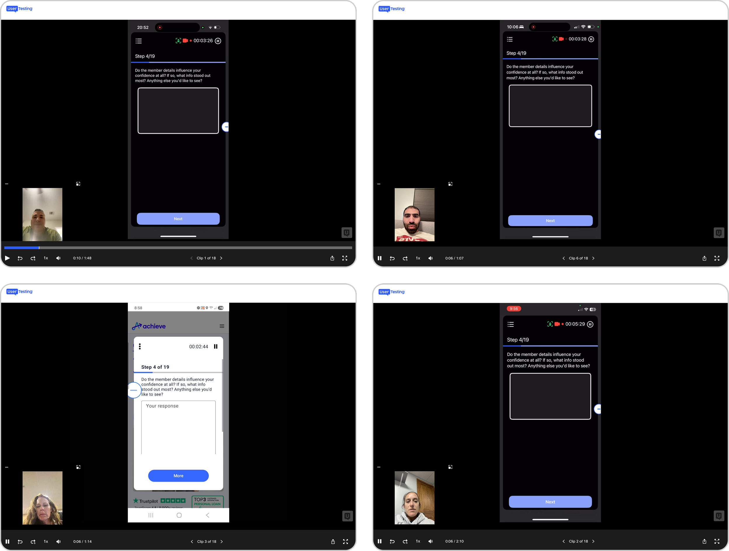
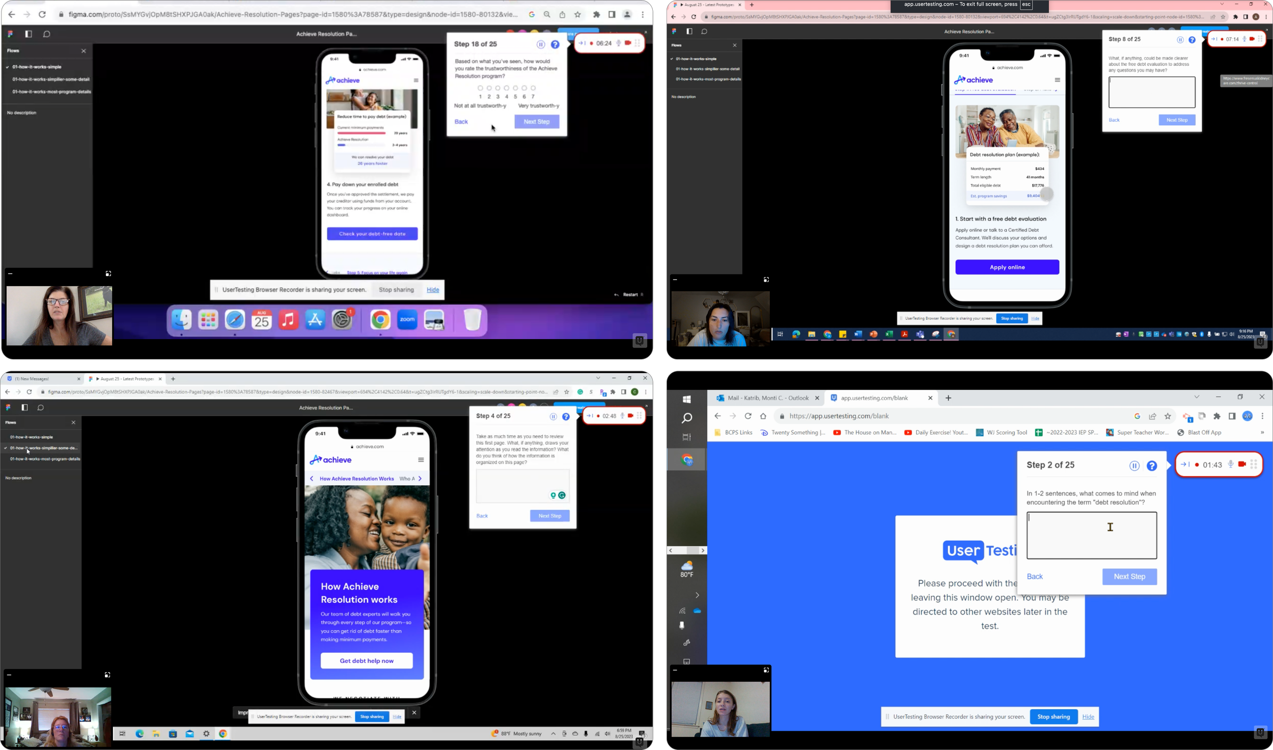
I put the concepts in front of people
I wanted to know whether people actually understood what we were trying to communicate — not whether they simply thought the page looked nice.
Could they tell me what Achieve did?
Did they understand the different financial options?
Which one felt relevant to them?
And did they trust us enough to keep going?
This is where a couple of things we had been debating internally became much clearer.
Our own credibility claims weren't doing as much as we thought
We had been using Achieve's own numbers to establish credibility. In testing, some people were skeptical of those claims. A few questioned whether Achieve was legitimate.
The reaction to third-party validation was noticeably different. People understood ratings and recognition from sources they already knew much more quickly. So I changed the hierarchy.
Instead of asking people to take Achieve's word for it, we brought independent proof much earlier in the experience.
05
We were talking to people as if they were already in crisis
Another important finding was around intent.
People exploring loans or debt consolidation were often evaluating their options. They weren't necessarily approaching Achieve from a crisis mindset. That distinction mattered.
Leading with debt-relief language could make someone looking for a loan wonder whether Achieve was even the right company for them. So we changed the emphasis.
Debt consolidation and loan-oriented language came forward. Debt relief didn't disappear — it remained an important path for people who needed it — but it no longer had to define the entire first impression.
That felt much closer to the way people were actually arriving.
06
The final experience
The final experience gave people a clearer way to understand Achieve and explore the products that might be relevant to them. I thought about the homepage as a sequence of questions:
What is Achieve?
Can I trust this company?
Does it offer something for someone like me?
What are my options?
What happens if I continue?
That thinking influenced everything from the hero and product hierarchy to trust, CTA language, education, and the way we helped people compare their options.
07
Our first test didn't go the way we expected
Once the experience was live, we could see something concept testing couldn't show us: how people actually behaved.
And the first experiment wasn't a clean win. Several top-of-funnel measures went down compared with the control. Overall lead rate, for example, moved from 4.72% to 3.85%. But deeper in the Personal Loans journey, we saw something interesting.
The Personal Loans close rate increased from 8.0% to 15.2%, and the broader APL close-rate measure increased from 8.05% to 16.67%. That gave us something worth investigating.
Instead of throwing out the direction because the first numbers weren't what we expected, we looked at what might be creating friction and what seemed to be working for people who continued further into the journey.
08
So, we tried again
For V2, we continued refining the experience around what we'd learned and ran another experiment.
This time the downstream signal was much clearer.
+63% Total enrolled
+59% Enrollment rate
+43% Margin per session
+120% Personal Loans enrolled
The lead rate was still slightly lower than the control. That was interesting to me. The experience wasn't necessarily about getting more people into the funnel. But we were seeing stronger outcomes from the people who moved through it.
It changed the way I thought about homepage performance. A click or a form start tells us something, but it doesn't tell us whether we've actually helped someone find the right product.
09
Takeaways
I started this project thinking mostly about the homepage. I came away thinking much more about intent.
We could accurately explain what Achieve offered and still get the experience wrong if we weren't talking to people from the place they were actually starting.
The project also reminded me why I like working on the web. You can put something into the world, see how people respond, learn that some of your assumptions were wrong, and try again. And when something starts working, you can ask a bigger question:
What can we learn from this that makes the next experience better?
That's ultimately where this project took me — from redesigning one page to thinking much more broadly about how we design, test, and evolve Achieve on the web. See how we took these learnings to our product pages through Achieve Personal Loans Redesign.