Achieve Personal Loans Landing Page · Achieve. com, 2025
Redesigning the entry point for a product people already wanted.
The APL page had the highest traffic-to-intent ratio on the site. Users were arriving ready to explore a loan, and leaving without starting. This is the story of how one CTA change, one line of microcopy, and a stripped-back information architecture moved the needle across the entire funnel.
Timeline: May to August 2025
Role: Lead Product Designer, 0 to 1
Team: 1 PMs, 1 UX Writer, 3 Engineers
Tools: Figma, Figma Dev Mode, Figma Make
Impact: +$638k incremental marketing margin/year. Lending first brand initiative: +$2M annualized total
01
The Achieve Personal Loans page had strong intent traffic, with users actively searching for a loan.
THE PROBLEM
But downstream conversion lagged. Something in the experience was creating hesitation at the exact moment users should have felt most confident moving forward.
"Most of our users weren't in crisis; they were financially responsible people looking for a better option. The page was speaking to someone in distress. We needed it to speak to someone in control."
90,804
Sessions/mo
38.6%
Direct-to-MP (baseline)
14.1%
Lead / Session
02
Users were arriving ready. The page wasn't meeting them there.
WHAT RESEARCH TOLD US TO DO NEXT
Before redesigning anything, I needed to understand where users were dropping off and why. Three signals stood out.
Process anxiety, not product rejection. Users weren't leaving because they didn't want the product. They were leaving because they weren't sure what clicking "Get Started" would actually do. Would it affect their credit? How long would it take? What was the commitment?
Trust was missing at the moment it mattered most. Trust signals, reviews, ratings, and third-party validation were present on the page, but positioned too low. Users were making their "do I proceed?" decision before they saw them.
The homepage A/B test informed everything. A parallel homepage test showed that more content created paralysis for financially anxious users. I applied that learning from day one: APL would be stripped to its essentials.
03
Four changes. One principle: earn trust before asking for commitment.
DECISIONS THAT HELPED MOVE US FORWARD
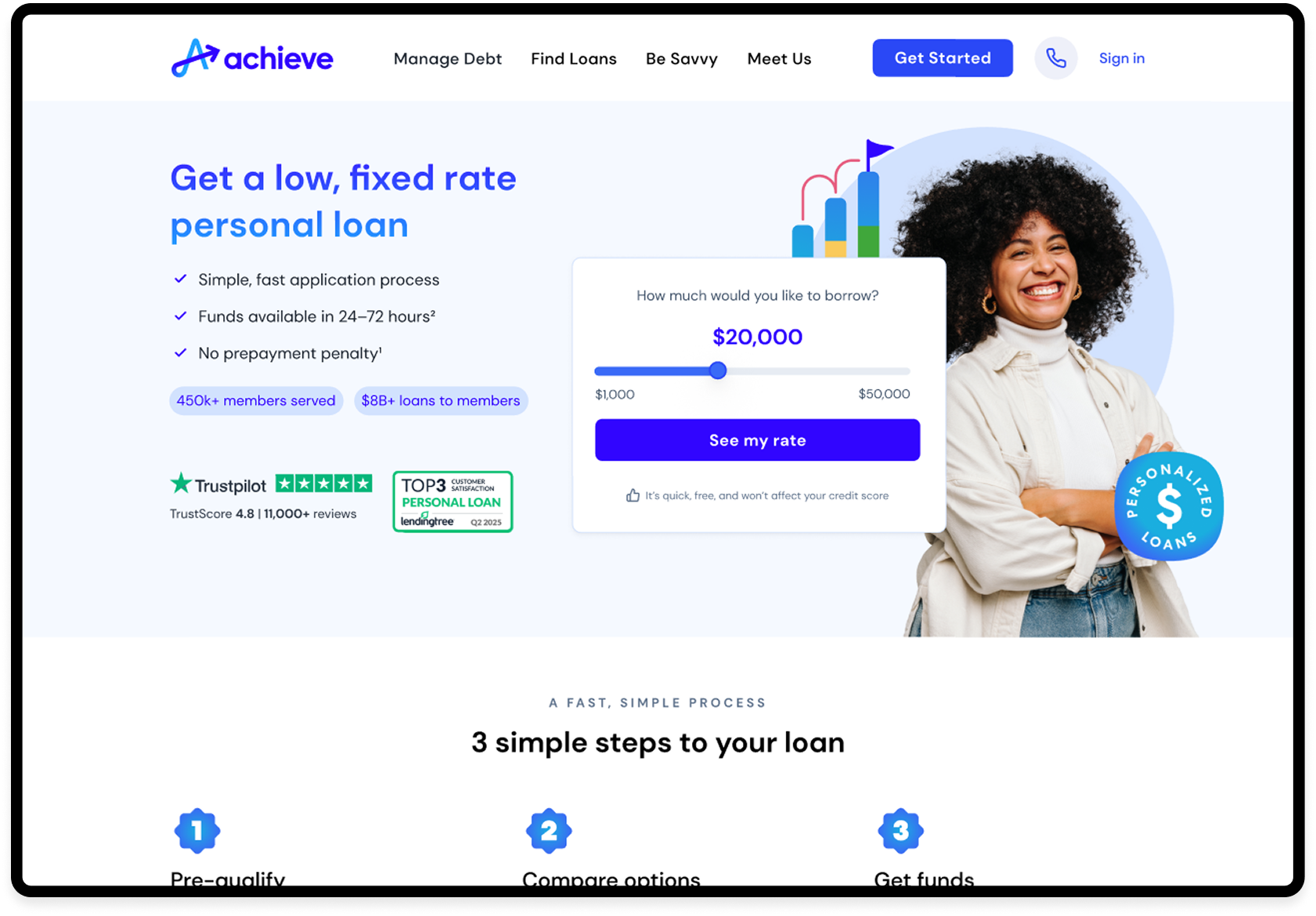
"Get Started" to "See my rate." This isn't a copy decision, it's a trust architecture decision. Apply implies commitment. See my rate implies exploration. For a user with financial anxiety, that distinction is the difference between clicking and leaving.
One line that probably drove more conversions than any visual decision. "It's quick, free, and won't affect your credit score." was placed directly below the CTA. Every word is doing functional work, addressing the three fears that research surfaced: time, cost, and credit impact.
Trust signals moved into the hero. Trustpilot 4.8 | 11,000+ reviews and LendingTree Top 3 badge repositioned above the CTA, not below it. Credibility at the decision moment, not after it.
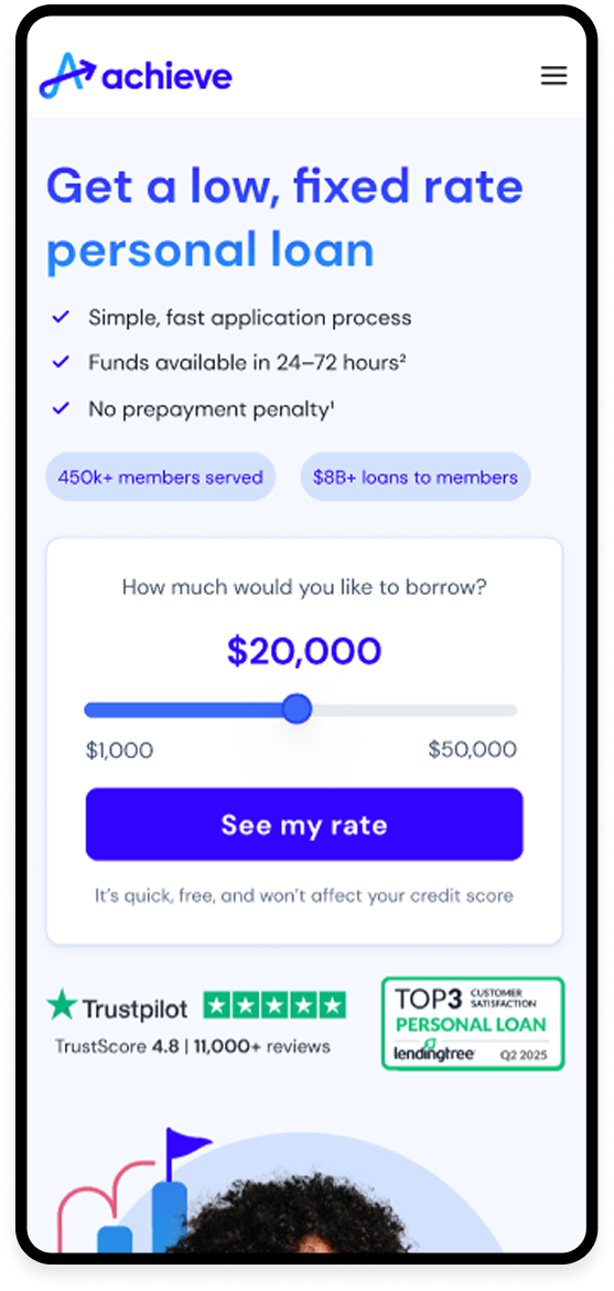
Radical simplification. Three value props. A three-step process section. No quiz, no product comparison ecosystem, no solutions sidebar. The homepage data showed that more content created paralysis. APL was designed with that as a first principle.
04
The variation didn't just attract more users. It attracted better-fit users.
WHAT HAPPENED IN PRODUCTION
The through-line: when you align the experience with the user's actual intent, every downstream metric improves.
+15.5%
Lead Rate
+29.2%
Enrollment Rate
+25.4%
Close Rate
+75.5%
Margin / Session
+$638k
Incremental margin / yr
05
Collaboration & Learnings
Beyond driving design execution, I facilitated alignment across Product, Engineering, and Risk through weekly design reviews, shared prototypes, and structured feedback loops. This surfaced tradeoffs early, helped unblock teams faster, and created a shared understanding of success metrics across parallel workstreams.
This approach allowed teams to move forward with clarity while maintaining momentum.
Leadership in Practice
Cross-Functional Collaboration
This project depended on close partnership across teams:
Product Management for roadmap and success metrics
Engineering for feasibility, performance, and implementation constraints
Risk and Compliance to ensure regulatory alignment
Research and Analytics for direction and validation
Data teams for tracking outcomes and iteration signals
Regular pairing sessions, alignment workshops, and collaborative reviews ensured decisions were grounded in both user needs and operational realities.
06
What the Achieve Personal Loans page taught me
APL applied every lesson from the homepage, narrower surface, single intent, no distractions.
Trust moved into the hero. The CTA became "See my rate." One line beneath it did most of the work: "It's quick, free, and won't affect your credit score."
Lead Rate up 15.5%. Enrollment up 29.2%. Margin per session up 75.5%. Contributing to $2M in annualized margin for the Lending First initiative.
What I’d Explore Next
The gains were driven primarily by mobile; desktop performance was softer against the control. In hindsight, I'd run a desktop-specific layout iteration earlier. The two surfaces have meaningfully different anxiety profiles for a user considering a financial product, and they probably warrant different design approaches from the start, not as a second iteration.