Achieve Personal Loans Landing Page Redesign
Page strategy, brand alignment, product intent alignment, design system updates, research & testing, cross-functional direction, and engineering handoff
Early test results showed a +19.3% lift in Direct-to-MP, moving from 47% to 56.1% within the first 4 weeks of the experiment.
01
-
Achieve’s Personal Loans page is the highest-performing landing page by traffic and engagement, with a strong 47% Direct-to-MP rate, but downstream conversion lagged.
Internal data showed users were entering the flow with loan intent, but lacked early trust, clarity, and confidence to continue into qualification.
This presented an opportunity to modernize the experience, close competitive gaps, and reinforce Achieve’s credibility in a regulated financial environment. -
Most users arrive with loan intent, but loan messaging was weak or unclear
Debt relief-first framing caused users to misunderstand Achieve’s broader offerings
Lack of legitimacy cues (trust badges, real member proof) created skepticism
Personal loans users with strong credit profiles weren’t seeing relevant solutions fast enough
Conversion fell at the point where users were forced to choose a product
Project Snapshot
02
-
Increase Direct-to-MP Rate by ~20%, from 47% to 57%
The core measurable goal of the project was to improve how many high-intent users entered the multi-product acquisition flow from the personal loans landing page. -
~$638k incremental marketing margin/year
Achieved by:
• Increasing qualified traffic entering the funnel
• Improving conversion efficiency without increasing paid spend
• Reducing friction and hesitation before checking their rate
• Every +0.2pp ER lift on head pages unlocks ~$2M incremental margin per quarter -
Increase Hero CTA interaction (more users checking their rate)
Increase scroll depth (engagement with “How it Works” and value props)
Increase trust element interaction (Trustpilot + social proof)
Improve clarity + comprehension (measured in usability testing)
Goal and Success Metrics
03
My Role & Responsibilities
Collaborated with:

Worked with Brand on voice and trust expression
Brand

PMs
Partnered with Product to define problems and KPIs

Engineers
Engineering to ensure feasibility + performance

Collaborated with PM + Data to define KPIs and A/B test structure
Data Science

Compliance
Compliance to meet regulatory standards
Defined the content ecosystem, module architecture, and page-level IA
Designed new modular approaches that now inform the broader acquisition ecosystem
Leveraged AI-assisted exploration to accelerate early IA and layout concepts
Facilitated alignment sessions and walkthroughs to ensure fidelity between design intent and implementation
What I Drove:
04
-
Clear comparison upfront
Competitors show rate ranges, terms, fees, and side-by-side benefits immediately—making decisions quick and low-effort.
Transparency builds trust
Key info like fees, eligibility, and funding timelines appears above the fold, helping users feel informed early.
Human visuals + scannable benefits
Customer imagery is paired with 5–7 quick benefits to make value easy to understand at a glance.
Clean layouts + focused CTAs
High-contrast sections, simple structure, and consistent CTA placement support fast scanning and clearer next steps. -
Key gaps in the existing personal loans page:
• Trust badges buried below primary content
• Low-intent headline and unclear hierarchy
• Over-emphasis on calculator
• Redundant value props lacking scannability
• Unoptimized mobile experience
Primary audience:
• Borrowers under financial stress
• Users with relatively high credit who want to consolidate debt
• Visitors unsure which product is best
• People skeptical of online lenders who need reassurance -
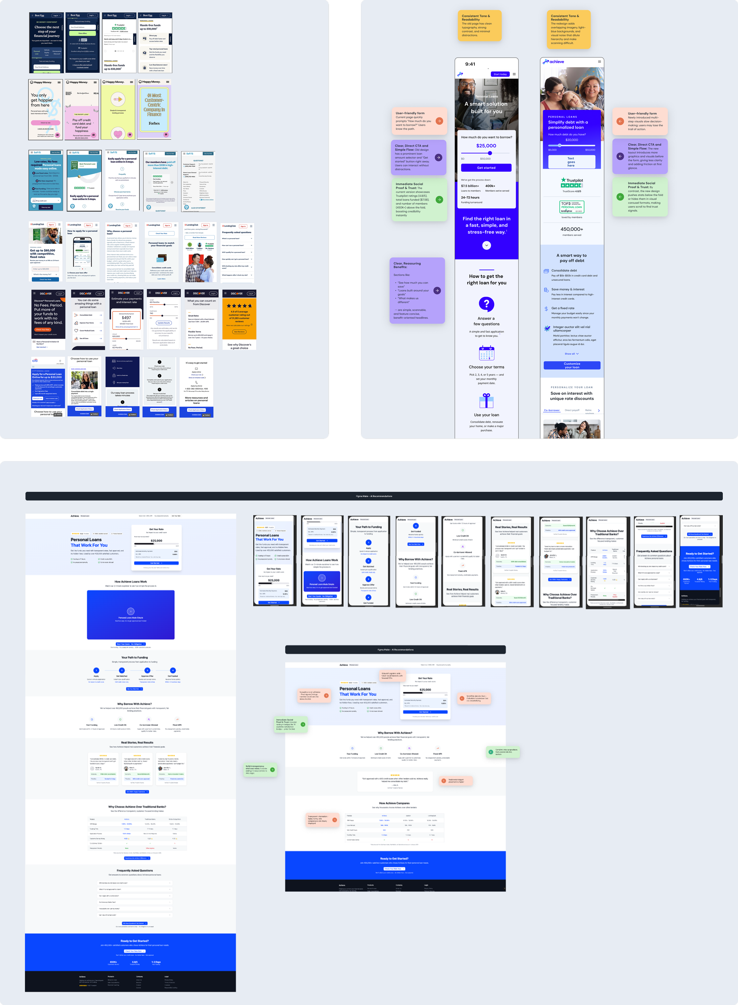
Why I used AI:
• Generate fast structural variations (hero-first layouts, value-prop)
• Explore 4–6 information architectures quickly
• Test variations of calculators, sliders, and trust block placementsWhat I adopted:
• Trust markers repositioned into the hero
• Hero text simplified to high-intent PL messaging
• 3-step guide added right under hero
• Value props tightened to 3–4 high-intent benefits
Design Approach
05
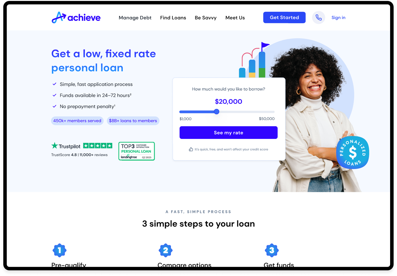
The Solution
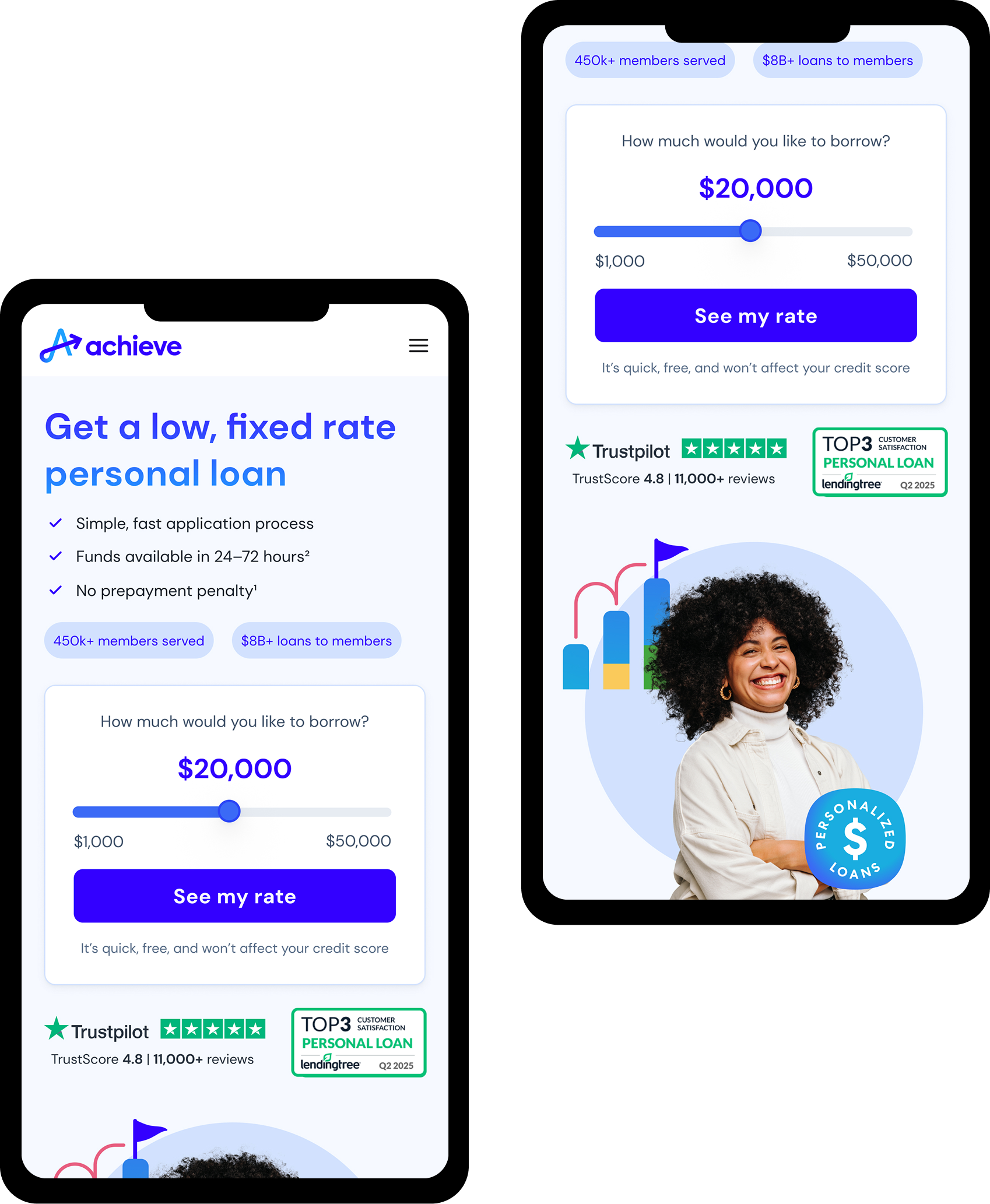
Clear, intent-driven hero messaging
Immediate visibility of key value props
Trust cues embedded directly into the hero
Interactive rate slider for fast exploration
Strong visual hierarchy with a high-contrast primary CTA
“See my rate” softens the tone a bit
For first time visitors, we added a line of copy to reassure the process is simple and has no impact to their credit profile
Above-the-Fold Transformation
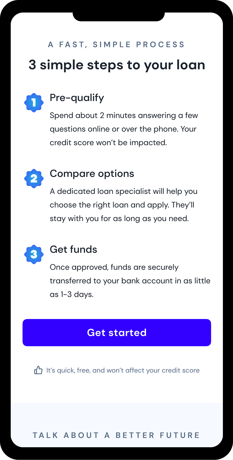
3-Step Loan Process
Pre-qualify
Compare options
Get funds quickly
Replaced dense text with a simple, scannable flow:
Clear explanation of loan benefits
Poof that Achieve is legitimate and trustworthy
Simple next step, not a complex decision tree
Rapid confirmation that they were in the right place
More transparency to less skepticism
To feel seen, not judged (distressed but credit-strong users)
Users needed:
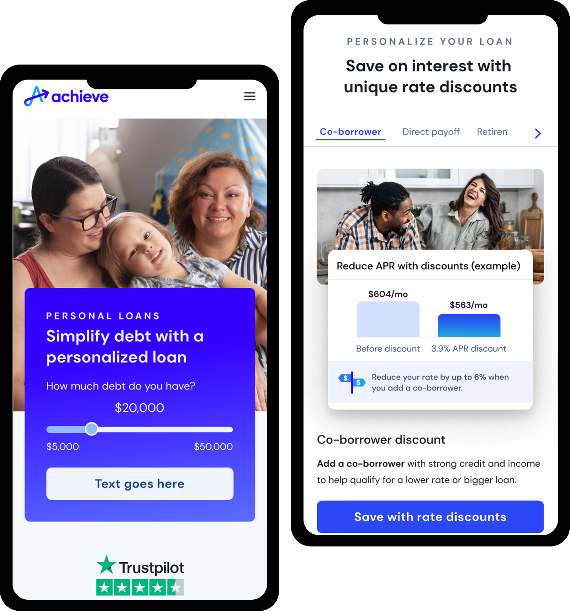
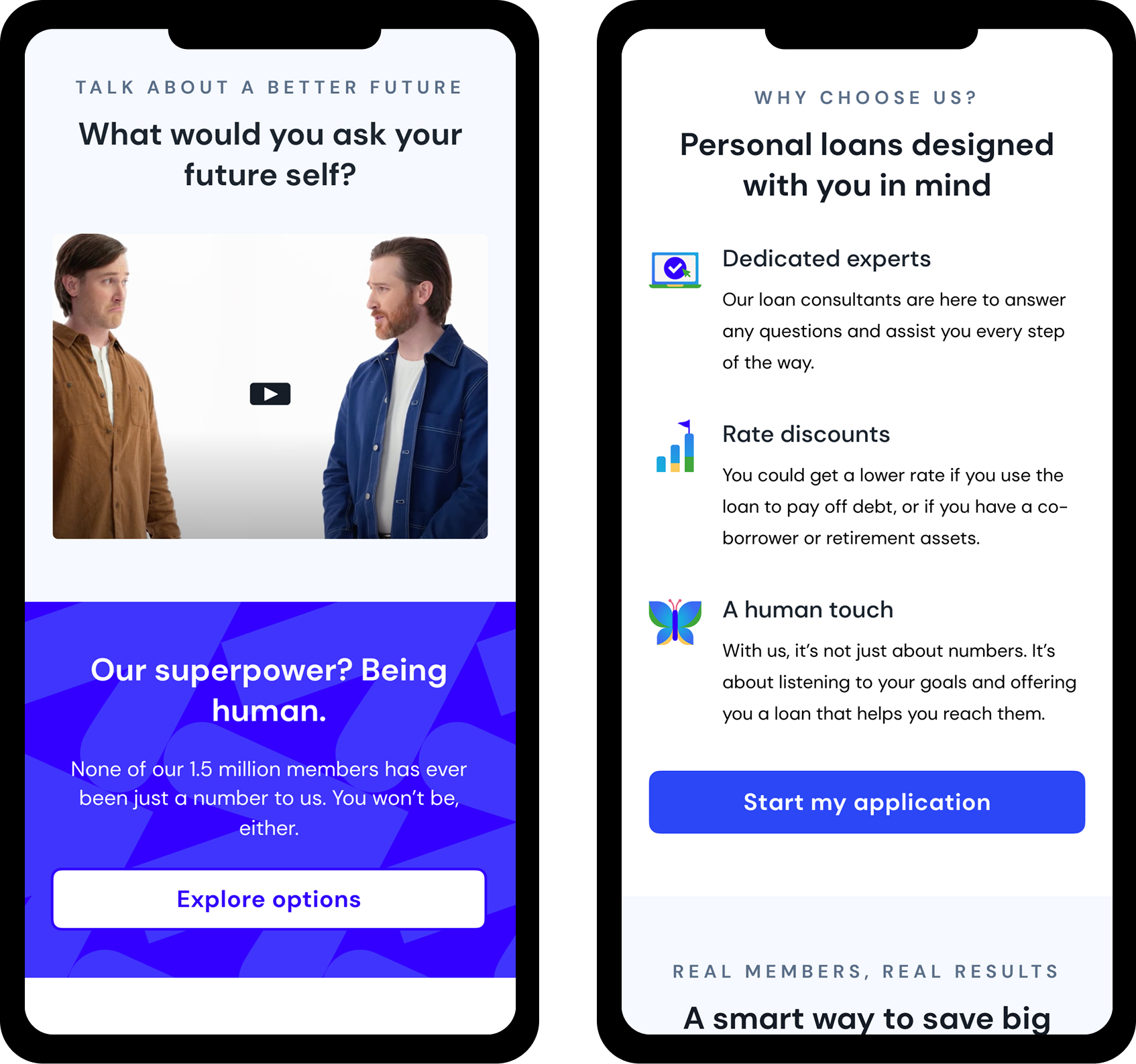
Video + Value Proposition Redesign
Human tone surfaced here with trust markers
Shifted from debt-relief-first messaging to loan-forward clarity aligned with user intent
Replaced generic photography with authentic HIW video to build emotional connection
Simplified content to reduce cognitive load for stressed users with strong credit profiles
Strengthened product-fit clarity so loan-seeking users immediately see relevant benefits
06
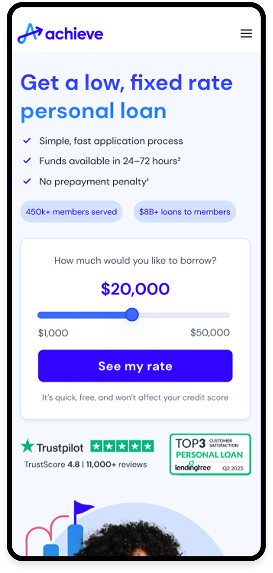
Final Designs
Enhanced readability
Balanced spacing
Trust cues higher in scroll
Stronger hierarchy
Mobile Design
Trust-based hero
Integrated rate slider
Refined value props
Simplified structure
Focused "How it Works" section
Clear CTAs
Desktop Design
07
Impact & Results

Early test results showed a +19.3% lift in Direct-to-MP, moving from 47% to 56.1% within the first 4 weeks of the experiment.
Primary KP
More high-intent users entered the qualification funnel
Reduced friction increased qualified traffic without additional marketing spend
Trust improvements led to lower bounce rates and deeper scroll engagement
~$150k margin in the first month

+12–18% increase in users reaching pre-qualification
Lower cost per qualified user due to more efficient self-selection
Improved traffic quality signals sent upstream to paid acquisition teams
Reduced drop-off at the hero by ~22%
Higher scroll engagement (+28%)